For sure I’m not the only homeowner who has been refreshing their mortgage options every day for the past few months. But are you also following swap rates?
Swap rates might sound like the relative popularity of Lionel Messi versus Cristiano Ronaldo in the Panini sticker trading game.
But they’re actually a vital bit of the financial system plumbing.
Swap rates largely determine mortgage rates, as well as much else that’s numerical and curvy in the financial world.
By keeping an eye on swap rates, you can better understand why you’re offered a particular mortgage rate.
True, you probably won’t bag a huge bargain on the back of it. Your mortgage offer will mostly depend on your income and deposit.
But at least understanding swap rates can help you judge why a given mortgage may be slightly more attractive than another, say, compared to if you didn’t know how they were priced at all.
Let’s dig in.
What are swaps?
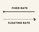
In finance, a swap is an agreement between two parties to exchange – or ‘swap’ – the cash flows from one asset for another, for a certain period of time.
Typically one stream of cash flows is fixed and the other variable.
Swaps are derivative contracts and the market is vast and deep. Estimates vary, but think hundreds of trillions of (notional) dollars, globally.
There are various kinds of swaps, differing by whether the variable cash flow is tied to an interest rate, a currency exchange rate, or some kind of price level.
For example you may recall the Credit Default Swaps (CDS) made infamous by the financial crisis and The Big Short. CDS enable investors to swap or offset credit risk on fixed income assets.
The swaps we’re interested in today are called interest rate swaps.
Interested in interest rates
In an interest rate swap, the cash flows exchanged are interest rate payments.
Most commonly, the swap exchanges a stream of fixed-rate payments for floating-rate payments.
Investment banks arrange swaps for a fee. The investment bank later offloads the risk via brokers to other investors, who want exposure for their own reasons. (Hedging or speculation, say).
Commercial and investment banks, big corporations, and very large traders typically make up the two sides (counterparties) of swap contracts.
What is the swap rate?
The swap rate is the fixed rate demanded by one party in the swap for the uncertainty of having to pay the variable (floating) rates that the other party wants to exchange, over some period of time.
Here’s what’s going on:
The receiver demands a particular fixed interest rate – or ‘swap rate’ – from the payer. In exchange, the receiver agrees to meet the payer’s (uncertain) floating rate payments over time.
The swap rate reflects the expected value of those future floating rate cash flows, as predicted by the money markets when the deal is struck.
At the time the swap is agreed, the two cash flows net out to zero and neither side stands to profit:
Source: PIMCO
In practice, variable rates are called variable for a reason. As the floating variable rate rises or falls, the contract will become profitable for one of the parties.
Note though that this doesn’t necessarily make the deal a bad one for the ‘loser’.
Think about when you take out a fixed-rate mortgage. The right reason to go for a fixed rate is to lock-in a regular and known cost for your future payments. It’s not to punt on interest rates.
Similarly, one party in a swap wants rid of the uncertainty caused by floating interest rates. If it loses a little money over time, that’s the cost of insurance.
Price moves everything around me
This all probably sounds very complicated, and on a deep level it is.
However, just as you don’t need to do a fundamental company analysis to buy Apple shares at the prevailing stock price, so participants in the swaps market basically follow the prevailing swap rate, which fluctuates with supply and demand.
How do swap rates affect mortgage rates?
Swap rates are what determine mortgage rates (but see below for a bit on bank margins).
Of course you might ask “what determines the swap rate?” but this article would go on forever. The short answer is interest rates, and expectations and uncertainty in the market.
But back to mainstream lenders and mortgage rates.
Let’s say a mortgage bank is in the mood for lending.
Many of us believe High Street banks lend out the cash deposited by savers as mortgages, but this isn’t exactly how it works.
A bank can create new money for loans via fractional reserve banking.
Alternatively it can tootle off to the money markets. There it might secure a couple of hundred million pounds worth of wholesale funding from other market participants.
It pays variable (/floating) rates on this money. However the lender wants to offer its customers fixed-rate mortgages, on which it will receive set monthly repayments. So there’s a mismatch here.
Even if the bank creates new money to make the mortgages, it’s in the business of providing retail customers with savings and loans, not in gambling on future interest rates. Also many of its liabilities will be related to floating rates, such as the interest it pays to savers.
So again, it will want to get rid of the risk inherent in offering a fixed-rate mortgage.
Enter the bankers’ bankers
In order to offer fixed-rate mortgages in a prudent and mostly risk-free fashion, our lender heads over to an investment bank.
These guys are only too keen to temple their fingers, smile menacingly, and arrange an interest rate swap that exchanges a variable cash flow for a fixed-rate cashflow.
Hey presto! The mortgage lender now has say £200m of money on which it will pay, for example, 4% for the next five years, thanks to the swap.
The investment bank is stuck with the risk of meeting the floating rate payments – but that’s its problem. (Which as I said earlier it will probably soon offload itself. But they are not the hero of this story, so we’ll leave them there).
The mortgage lender can now proceed to offer its customers £200m worth of fixed-rate mortgages at 4%. (Or a little more than 4%, because it wants to make a profit).
Crucially, the mortgage bank doesn’t have to worry about the variable rate going up to say 6%, and these fixed-rate mortgages becoming unprofitable.
It got rid of that interest rate risk, via the swap.
Bank competition also affects mortgage rates
If swap rates and mortgage rates were one and the same, then we’d have no need of comparison sites or shopping around. All banks would offer the same rates. At least for the same terms.
But in practice mortgage rates vary across lenders.
As I write, the average five-year fixed-rate mortgage is charging 5.27%, according to data provider Moneyfacts. But home buyers with a 25% deposit can bag a five-year fixed rate from Yorkshire Building Society costing just 4.18%.
This chunky gap between the best rate and average rate – more than a full percentage point, or 109 basis points in City lingo – reflects the difference in margin the banks aim to make from their mortgages, and how keen they are to win business.
It’s not rocket science to see that a lower mortgage rate will attract more borrowers, all else equal.
But charging a lower mortgage rate will earn the bank less money – margin – too, reducing the profit per customer.
A lower margin also means there’s less ‘buffer’ in the cash coming in to meet the bank’s other obligations. This will especially matter if mortgage delinquencies rise (and it subsequently receives less of those expected fixed-rate cash flows).
Hence cheaper rates also reflects a bank’s willingness to take on more risk.
Banks juggle all this according to their strategy – market niche, confidence in their mortgage underwriting, and their balance sheet – as well as their usual herd behaviour.
(Bankers like to do what everyone else is doing!)
Remember when the Mini Budget blew up the market?
You can now see why mortgages got so expensive in the midst of the 2022 Mini Budget dysfunction.
Swap rates skyrocketed, partly because interest rate expectations spiked on the prospect of additional unexpected and unfunded government borrowing, but also because of a huge rise in uncertainty.
Spot the Liz Truss moment in this graph of two-year interest rate swaps:
Source: Investing.com
The spike in swap rates immediately impacted the future pricing for mortgages.
But the tumult also had a secondary affect, which was that mortgage lenders got the willies. They pulled thousands of their mortgage products in order to buy time to wait and see, and to price their products properly.
Thankfully, even this generation of Tories realized that the Liz Truss spectacular was a step too far in their post-Referendum battle against Britain’s prosperity.
So Truss got the chop and more sober politicians came in.
And we can see this clearly in the chart. Two-year swap rates are now back to where they were before the whole debacle.
Note that’s despite more interest rate rises from the Bank of England since. The market had already priced in those rises, prior to the possibility of additional ones due to ‘Trussonomics’.
Where does this leave the mortgage market?
The money markets have hugely calmed down since Liz Truss and Kwazi Kwarteng were ousted in favour of the comparatively trustworthy Rishi Sunak and Jeremy Hunt.
Whatever their pros (they’re not Tory ultras) and cons (they still spout fantasies about economic ‘Brexit benefits’), the pair have promised fiscal sobriety, no funny business, and to show their workings.
Foreign and domestic capital has taken them at their word. The bond vigilantes have stood down. The so-called moron premium in UK rates has mostly dissipated. And swap rates have declined from the distressed levels we saw during The Muppet Show of September 2022.
As you’d expect, that has brought mortgage rates down. Although sadly not quite to pre-Mini Budget levels.
For example:
- The average new two-year fixed rate mortgage was 4.74% just before the Mini Budget.
- The average rate for the same mortgage is 5.5% at the time of writing.
Why the 75 basis point gap?
It’s true the Bank of England has continued to hike interest rates. However the forward curves implied this even before the Mini Budget.
Sure, nailed-on rate rises are more convincing then ‘almost certainly’. But only unexpected increases in the rate or duration of higher interest rates should lift swap rates.
More probable I think is the outlook for the UK economy – and its housing market – has worsened since early September 2022.
That could imply the Bank of England won’t raise rates so aggressively.
Indeed the current swap rate curve implies the Bank of England will be cutting Bank Rate from the today’s 3.5% within a couple of years:
Source: Bank of England
However the Bank of England’s focus is currently on bringing inflation down to target. And progress here is still only modest. Visible, but modest.
What’s more, there’s clearly a ton of economic strife going on, with workers everywhere demanding double-digit pay increases. Big wage hikes are certainly inflationary.
Given all this, I wonder whether most of the banks have simply been looking at the fatter margins on their mortgage products versus last year, and not feeling any great rush to trim them?
In other words, the mortgage lenders remain more skittish than before the Mini Budget.
On the other hand, mortgage experts always said it would take a while for mortgages to re-price following the September ructions.
And mortgage rates are still inching down each week. The best fixed-rate mortgages are much cheaper than the average, if you can get them. Maybe the spread over swap rates will continue to close.
What does it mean for a would-be borrower today?
So should you look to get a variable or tracker-rate mortgage, at least for a while, and wait for lenders to bring fixed-rate mortgages down further?
Mortgage rates will probably continue to decline, but this isn’t a certainty. If the last year’s Russian war, energy price ructions, and political turmoil taught us anything, it’s that things happen.
On the other hand, while a variable rate mortgage will probably be more expensive to start with, it might be a price worth paying if you can switch to a sub-4% five-year fix in a few months time.
That’s not a prediction – but others are making it.
From FTAdvisor:
Brokers have shared their latest predictions on when fixed mortgage rates will fall below 4 per cent, with some saying they are likely to come down “by March” while others are “doubtful” rates will fall that low for at least the next six months.
As I noted earlier, one lender is already offering a 4.18% five-year fix. Others should follow.
However, as always, fixed-rate mortgages are chiefly about the certainty of forward payments, not interest rate speculation.
If you can truly afford (a) higher standard variable rate payments today and (b) the risk of having to eventually lock into a more expensive fix because ‘something happens’ tomorrow, then there may be a case for waiting a few months.
But what’s most important is to buy (or remortgage) at a rate that you can comfortably budget to and manage.
I’m keen to hear from other readers who’ve recently had to negotiate these mortgage markets. Anyone else watching swap rates? Or unfortunate enough to have remortgaged under Truss?