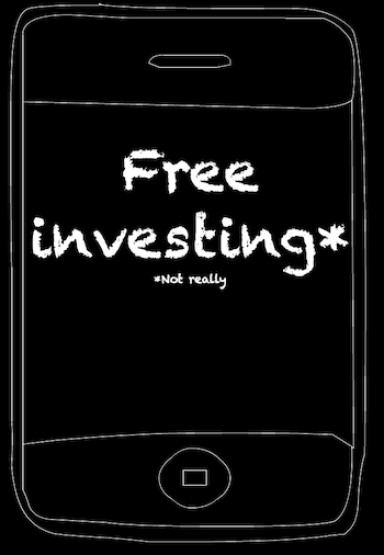
≡ Menu

How to read a bond fund webpage

How to read a bond fund webpage post image

This is my take on the important elements of a bond fund / ETF1 webpage.

By running through the info that I pay careful attention to, my hope is that new investors will find it easier to understand bonds and to do due diligence on an asset class that many find confusing.

  • If you’re doubtful about the wisdom of owning bonds, learn more to see why they may still be a good investment.
  • If you’re truly a bond refusenik you can also check out my equity-orientated article on how to read a fund factsheet.

Diving into a bond fund

I’ll illustrate my approach using the webpage for iShares Global Government Bond ETF (IGLH).

iShares fund webpages are pretty good overall. They contain much that you need as well as plenty that you don’t.

Other fund providers offer similar fare, but the data may be labelled differently.

If any of the information below is AWOL from a bond fund webpage or factsheet then I mark it down versus other candidates on my shortlist.

Fund name and overview

Fund names can reveal quite a lot of information, which makes up for them being about as memorable as a robot’s serial number.

Our fund names explained piece reveals what’s in a boring name.

Several funds may share a similar name but actually invest in materially different sub-asset classes.

It’s like going to a big family gathering, when you’re age seven, and meeting an endless parade of uncles and aunts. They all seem friendly but you’re mystified as to how they relate to you.

A fund family tree can reveal a hierarchy of spin-offs (known as share classes) that differ by currency, cost, income distribution, and so on.

Note down the ISIN number, SEDOL, or ticker. This way you can guarantee you’ll get the same product when you later search for it via your broker’s platform. Don’t rely on the fund name.

iShares have a nice dropdown menu just under the fund name that reveals your choice of share classes.

Vanguard doesn’t always list its funds’ available share classes, but the passive giant typically offers both Accumulating and Income flavours. Check your broker or dealing platform to see if it offers the version you’re after.

Investment objective

Check the fund’s description mentions the sub-asset class you expect the fund to track.

For example: ‘developed world government bonds’.

I also look for a phrase like ‘…tracks the performance of an index…’ to affirm I’m definitely dealing with an index tracker.

Performance

Past performance is not the big deal many people think it is.

You can’t tell anything from one-year returns and not much from three years.

Five years gives you a sense of how well the fund matches up against its rivals. Ten years is far better, and about as much data as you can expect for free.

But what really matters is your strategic asset allocation and the role your fund fulfills in that.

If you decide an asset class belongs in your portfolio, then make sure:

  • Your fund properly captures that market – see the benchmark index section below.
  • It’s not outclassed by its peers. (I’ve explained before how I use past performance to compare the best bond funds on the market.)

It’s irrelevant that a particular global government bond fund lost 1% over the last three years, provided other global government bond funds lost much the same.

Don’t worry if your fund trailed a competitor by 0.5% in one year. Subtle differences in index composition and fund methodology can easily explain that away. Your fund may well beat the pack next year.

However if your pick consistently underperforms its near-rivals by that amount or worse, on a five-year view, then investigate why.

If your fund always lags when you compare like with like, then switch to another.

Key facts

iShares’ ‘Key Facts’ mostly just need a quick eyeball to check nothing is amiss.

Net assets or Assets Under Management (AUM)

Small funds are vulnerable to closure if they don’t attract enough investment cash. Assume new funds will get 12-months to prove themselves profitable.

Anything over £100 million in assets under management should be okay.

Remember you don’t lose your money if your fund closes. Its underlying assets still retain their market value.

However your shares will be sold on closure of the fund. That could trigger Capital Gains Tax, if your fund isn’t tucked inside your tax shelters.

You also run the risk of an adverse market movement when you’re sitting in cash.

Your provider may offer two AUM figures.

A larger one labelled ‘fund’ or ‘umbrella’ is liable to be the sum of the master fund’s share classes.

Go with the smaller figure, which concerns your particular sub-fund.

Currency

Your exposure to currency risk depends on the currency your fund’s underlying assets are priced in.

Remember, you are still taking currency risk if you choose a GBP (British Pound) version of an unhedged fund that invests in overseas securities.

If your global bond fund holds US, Japanese, and German securities, say, then you’re exposed to the pound’s exchange rate versus those country’s currencies.

Terms like base currency, denominated currency, or fund or share class currency refer to the currency your fund reports in. These are simply accounting terms.

Trading currency means the currency the fund is bought and sold in on your local stock exchange. That makes no difference to currency risk but choosing GBP can save currency conversion fees.

You’re only shielded from currency risk if your bond fund explicitly states it is hedged to GBP or if it only holds securities priced in pounds. 

Ongoing Charge Figure (OCF) / Total Expense Ratio (TER)

Your fund’s headline cost is a key metric. Cheap is good and less is more when it comes to fees.

But neither the OCF nor TER include all charges due. 

Fund providers routinely deny us the complete picture because they’re not harried into full disclosure by the regulator.

For instance, transaction costs add up like baggage fees on a budget airline flight.

I give bonus transparency points to providers who publish transaction costs on their fund’s webpages. Xtrackers does this, for instance.

Vanguard scores half marks because it publishes its extra expenses – but only in an obscure PDF squirrelled away on its website. 

If iShares does us a similar service then it keeps it quiet like a shameful family secret.

You can uncover the impact of undisclosed charges using this tracking difference technique.

Product Structure / Replication Method

Physical means your ETF actually holds the assets it claims to track.

Duh, yeah. So what?

Well, you’d think that it’s de rigueur but it’s not…

Because in contrast synthetic means your ETF typically does not hold the assets it aims to track.

Instead, investors’ cash is ploughed into a derivative that matches the return of the fund’s index. 

Synthetic ETFs get to the same place as physical funds by way of ever-popular financial engineering.

The term synthetic has an image problem nowadays. Hence these synthetic ETFs are usually branded as ‘indirect replication’ or ‘swap’.

But I don’t particularly discriminate between physical and synthetic because both types usually come bundled with counterparty risk, anyway.

Methodology

Sampled or optimised means the fund doesn’t hold every last security covered by its index. Very few funds do because small and illiquid securities rack up costs while making little difference to your returns.

You can use tracking difference to test whether the methodology’s deviation from the index has historically cost much by way of return.

Securities lending return

Many funds lend out your securities to short sellers (including active fund providers that often neglect to mention it, incidentally).

Your provider’s lending policy should be published. Some portion of the fees earned may be paid to the fund, which should nudge up its returns.

Securities lending exposes physical funds to counterparty risk, however.

I don’t worry about this risk but I’m aware of it. I think of it as a tie-breaker situation.

Ideally, my choice will keep its securities under lock and key. If it lends them out, then I want the highest possible share of the profits. 

But if one fund lends and regularly beats my other candidates then yeah, I’ll probably take jam today. 

Domicile

Where is the fund based and regulated? Most ETFs are quartered in Ireland and Luxembourg. The UK regularly crops up for funds, as opposed to ETFs.

A UK domicile offers you the comfort of the FSCS compensation scheme.

Ireland and Luxembourg’s equivalents are much less generous.

Ireland’s double-taxation treaties give it a withholding tax edge over Luxembourg.

Benchmark index

Trackers track indexes. That’s their job so make sure you get the right match. Google the index and read its factsheet.

Think about:

  • What market does the index track?
  • Does that market adequately capture the asset class returns you’re after?
  • Is the index widely used by the industry? If not, why not?
  • Can you find good information about the index?
  • Is the index diversified? If not, does that matter?
  • Do the index holdings overlap with other funds you own? That can mean the fund is redundant in your portfolio.
  • Does the index guard against over-concentration by capping the weight of its constituents? If not, do its rivals?

Other Key Facts

Risk rating – I don’t think this offers much in the way of genuine information. Still, if you think that you’re buying a low-risk fund but the rating indicates Indiana Jones-style adventures ahead… that could be a sign something is wrong. 

UK reporting status (UKFRS) – Check it’s a yes, otherwise you may pay excessive tax.

UCITS – Again, we’re after a straight yes. This is comforting EU regulation that was transposed into UK law after Brexit.

Use of incomeDistributing or Income means interest will be paid into the account of your choice – handy for retirees. Accumulating or capitalising means the fund automatically reinvests your payouts – handy for accumulators.

Minimum investment – Don’t be thrown if this says something like £100,000. That is directed at institutional investors, not us. Look for the product on your investment platform. If stocked then you’ll be able to invest the minimum decreed by your broker – £50 or whatever.

Portfolio characteristics

These elements are key to understanding what you’re getting from a bond fund:

Yield to maturity (YTM)

This is the annualised return you’d expect to receive if you invest in a bond and hold it to maturity (accounting for its market price and the remaining interest payments, which are assumed to be reinvested at the same rate).

Providers will often display other yields but yield to maturity is the only one you really need. That’s because you can use it to compare similar bonds that vary by price, maturity date, and coupon rate.

The Investor wrote a classic piece about the most common bond yields.

Maturity

We often talk about short, intermediate, and long bonds on Monevator. Those lengths refer to the average maturity dates of a bond fund’s holdings:

  • Short-dated bond funds are the least risky, least rewarding and least sensitive to interest rate changes.
  • Long-dated bond funds are the most risky, most rewarding (potentially) and most sensitive to interest rate changes.
  • Intermediate bond funds sit somewhere in the middle. They hold short and long bonds, along with medium maturities, in a diversified portfolio.

See the duration metric below for a practical measure of your fund’s interest rate risk.

  • Short bond average maturities are five years and less.
  • Long bond average maturities are 15 years and more.
  • Americans think of five to seven years as the intermediate maturity sweet spot. But gilts skew longer.

Long bond funds should have a higher yield to maturity and duration than short bond funds of a similar type.

Duration

Duration can be used to gauge your bond fund’s sensitivity to interest rate changes:

As a rule of thumb, a bond fund with a duration of 7 will:

  • Lose 7% for every 1% rise in its yield to maturity.
  • Gain 7% for every 1% fall in yield to maturity.

Whatever your bond fund’s duration number, that’s roughly how big a gain or loss you can expect for every 1% change in its yield.

Duration helps you assess the risk you’re taking, assuming you have a strong opinion about the future direction of bond interest rates. 

There are multiple types of duration but it’s not worth losing sleep over the slight differences between them.

This piece on bond prices helps explain how interest rate changes impact bond yields.

Credit rating / credit quality

Credit quality is a verdict on the financial strength of the bond issuer as delivered by the main credit rating agencies.

The lower the rating, the greater the perceived risk that the borrower will fail to pay their debts.

All things being equal, investors demand higher interest rates from weak borrowers.

Annoyingly, many providers don’t publish an average credit rating for their fund’s holdings. Kudos to Vanguard who does.

So when you’re parsing your fund’s credit quality chart, be mindful of these thresholds:

  • AAA is tip top.
  • AA- and above is considered to be high-quality.
  • BBB- and above is investment grade.

Anything below investment grade is junk. (That’s the industry term, not my opinion. Well, not exactly! A less evocative term for junk is ‘high-yield’).

Only investment grade to high-quality funds belong in the defensive side of your asset allocation.

Investors flee to quality in a crisis. So that’s when you need your bond funds to come through.

Beware – Some naughty providers feed you the index’s key characteristics and not the fund’s. That’s a serious transparency transgression.

Sustainability characteristics

Given the finance industry is deluged with greenwash, I don’t pay much heed to self-reported sustainability metrics.

If you think that sounds glib then please read this Monevator piece on the complexity of Environmental, Social, and Governance investing.

Here’s my take from the days when trying to do good was called Socially Responsible Investing

Holdings

I look at the Top 10 holdings to ensure they tally with what I think the fund does.

I’ll also check the Top 10’s percentage weights to verify my pick isn’t over-concentrated in comparison to its alternatives.

A diversification once-over isn’t necessary for gilt funds. All gilts are high-quality bonds priced in pounds. There’s no need to look under the bonnet.

I also stop short of wading through spreadsheets that name-check hundreds of holdings. I’m not qualified to judge individual securities.

What’s more, I’m not a masochist. This article not withstanding. 

Exposure breakdowns

Reading the portfolio breakdown section is like checking the ingredients label on a supermarket food item. Write-off the calories, wince at the sugar content, then stare blankly at the long list of emulsifiers and other chemical mysteries.

Well, there’s no sugar in bonds but it’s worth corroborating there aren’t any other nasty surprises in store.

Returning to our iShares Global Government Bond ETF candidate, you may be surprised to see that the currency exposure on a global government bond fund is 99.6% pound sterling. However that simply confirms we’re definitely looking at the hedged version.

The currencies listed show you what currency risk you’re taking in an unhedged fund.

The geographic breakdown verifies this fund invests purely in the developed world. I don’t attempt to second-guess whether, for example, 7.35% German bunds is just the right amount, however. Knowing that is about as useful to me as wine notes:

“Oh, this bond fund has wonderful notes of coarse sausage, accented with wild French garlic, and a heavily hocked public sector. One can almost hear the creaking of the balance sheet.”

Sector / issuer splits are worth a shufty, especially in aggregate market funds. The weight of corporate holdings is liable to reduce your fund’s recession-resistance versus high-quality government holdings.

You should get credit quality and maturity breakdowns, too, but we’ve discussed what to look out for earlier. 

Fund documents

Read the KIID and factsheet at least. The factsheet often contains useful, extra info.

Valuable nuggets can occasionally be plucked from the legalese spoil within the annual report.

Check the Reportable Income docs if your fund sits outside your ISA / SIPP tax redoubts.

Bond article survivors’ group

Peace be with you weary reader. It’s over! Please give me a shout-out in the comments if you made it this far.

It took me seven years to summon up the strength to write this beast. Hopefully it will help someone struggling with bond funds.

As for me, I’m off to have my head examined.

Take it steady,

The Accumulator

  1. An ETF is a type of investment fund, so I’ll use the term ‘fund’ when referring to generic characteristics shared by index trackers. []
{ 13 comments }

Is there a case for gearing up your investments?

Image of gears

This article on gearing is by Planalyst from Team Monevator. Every Monday brings more fresh perspectives from the Team.

Borrowing to invest – or ‘gearing’, as seasoned investors call it – is as simple as it sounds to get started.

You take out a loan. Then you invest it as you would your own capital for potential growth. 

However the journey and outcome you’ll get from gearing is much more complicated and uncertain from there.

What a difference a decade makes

The Investor explained in a mini-series a decade ago why borrowing to invest is usually a bad idea.

Just as he was writing coming out of a recession, so I am with this article. 

Gearing is common practice for businesses, investment trusts, and fund managers. And it has been steadily increasing to the point that margin debt – gearing directly applied to an investment portfolio – is at its highest level in the US for more than 10 years. 

But a big difference between now and back then when a younger, better-looking Investor was sharing his thoughts is that personal loan interest rates are much lower today.

Best Buy personal loan rates are below 3% APR. That’s a far cry from the 10% The Investor talked about in the aftermath of the financial crisis. 

Still, with the post-pandemic economy recovery we’re already hearing talk of central banks pushing up base rates to combat higher inflation.

Does that make it a good time to gear up your portfolio by fixing a low interest rate loan for long-term investment? 

The good, the bad, and the gearing

I recently explained gearing to Mr Planalyst. He wondered why I didn’t use gearing for my investments to try to ratchet my returns even higher?

Particularly, he noted, because my investments have made an average 11% return a year. (Thank you, bull market!)

Mr Planalyst saw it in simple terms. Why not use someone else’s money to make us more money? 

So we sat down to planalyse this idea. And I created the tables below to explore the following ‘what if’ scenario.

Say we borrowed £30,000 to invest, at a 3% annual interest rate over a 10-year term.

For simplicity, we’ll assume the compounded debt interest is rolled up to be repaid at the end of the term, with the original capital. (Personal loans are usually repaid over time, but this makes the maths very complicated).

A calculator tells us that this borrowing and interest totals £40,317.

We’ll also assume the borrowing is all invested in a single passive tracker fund. And we’ll model returns according to two example scenarios.

Gearing scenario 1: good times

The UK market tends to see at least one steep decline every ten years or so. Typically stocks will fall 20% or more during these drawdowns. 

Our first table therefore shows the potential position of a borrowed £30,000 after ten years that suffers one such crash. (All numbers rounded to the nearest pound.)

In this (fictitious!) example we see an average annual return of around 4% overall. But there’s a fall of -20% in one grim year halfway through:

YearPortfolio valueAnnual return %Annual return £
1£30,0009%£2,700
2£32,7008%£2,616
3£35,3169%£3,178
4£38,4947%£2,695
5£41,189-20%-£8,238
6£32,9512%£659
7£33,6104%£1,344
8£34,9555%£1,748
9£36,7027%£2,569
10£39,2729%£3,534
End total / average return£42,8064% 

In this first scenario, using gearing worked out positively – although the end result was only a little ahead of the cost of borrowing (£40,317).

Remember: market volatility means you can’t guarantee any returns.

There’s no certainty of a gain at the end of the borrowing period to repay the debt and the interest accrued. Never mind enough to deliver a profit for going to all this trouble in the first place!

Even if you come good in the end, seeing your total invested assets that you bought with gearing go below the amount at stake during the term won’t be easy. It could be emotionally upsetting.

Obviously it’ll be even worse if you come up short at the end of the term.

Talking of which…

Gearing scenario 2: bad times

In this scenario our returns are almost as before – except for the last two years.

This time the market’s recovery from its decline is very sluggish, rather than it bouncing back to pre-downturn levels as in the first scenario.

And again, after ten years your term is up and your debt must be repaid:

YearPortfolio valueAnnual return %Annual return £
1£30,0009%£2,700
2£32,7008%£2,616
3£35,3169%£3,178
4£38,4947%£2,695
5£41,189-20%-£8,238
6£32,9512%£659
7£33,6104%£1,344
8£34,9555%£1,748
9£36,7024%£1,468
10£38,1712%£763
End total / average return£38,9343% 

After ten years you don’t have enough to repay the loan plus its interest – £40,317 – let alone seen a profit.

This example demonstrates the risk of having to sell when your capital is down to repay your debt. You are forced to realize a loss.

You might have fretted about this outcome for half the loan term – from year six onward. And the risk would have come true.

Maybe you’ll have greyer hair, too.

Debts must be repaid. You would have to dip into other savings or income to repay the bank what you owe. Assuming that was even an option for you.

Outcome

Here’s how the numbers work out from these two scenarios after ten years:

ScenarioDebt and interestPortfolioBalance
1£40,317£42,806£2,489
2£40,317£38,934-£1,384

In the second example, we see how interest – the cost of debt – has amplified the losses compared to just investing £30,000 of your own money.

Of course you might see far higher average annual gains than 3% or 4% over ten years. That would make borrowing to invest very lucrative.

But you could also see lower returns, too.

This unpredictability of future market moves is why I wouldn’t consider gearing to invest. The risk of volatility and market falls at the worst time are too great to ignore – even for that chance to make a healthy profit.

Historically, stock market returns have been far higher than today’s low cost of debt, which might make the odds seem pretty good.

But personally I don’t have the stomach for it.

Gearing up for a fall

You say you’re willing to accept the market’s ups and downs? There are other factors and caveats to consider before you gear up. 

More risks to think about

In the above examples, I kept the structure of the loan very simple.

You could use monthly or annual interest repayments instead to take the pain away from repaying a lump sum at the end. The exact loan structure chosen upfront could even make or break the eventual returns. This adds extra risk – it could turn out to be wrong for your future circumstances. 

With such an arrangement you’d also need to keep up regular repayments, adding to your household expenditure. This would reduce your disposable income for any other investment opportunities that may arise over the fixed term of the loan. 

In the event of a market crash – perhaps with a recession – having to make regular repayments could prove tough if you faced job insecurity. 

And don’t forget investment costs along the way. These haven’t been explicitly broken out in my examples above. They will eat into any growth. 

You may also have taxes to pay on your gains when it comes time to repay, though this depends on how you invest.

Investing in an ISA can take away the tax pain, as a Monevator article by Finumus recently stressed

Risk reducers

You might be attracted to variable interest rates loans, particularly if they start off lower than a fixed rate option.

But variable rates add extra interest rate risk. Locking in a fixed rate now makes future budgeting certain, even if your investment returns are not.

Taking out a long-term loan for investment can soften the blow of short-term market volatility. Investing is a long-term game. Securing returns is more about time in the market than trying to time the market.

In contrast, you’re likely to risk making even greater losses by gambling to chase returns to repay a debt over a short timescale. 

This is why The Investor suggested in his series that a mortgage is the only debt that’s prudent for most people to consider while also investing in risky assets like shares.

Finally, you may choose to diversify across different asset classes and funds, rather than rely on one tracker.

Properly diversified investments would mitigate the downside risk, at least to some extent, but it could also curb your expected returns. 

Changing gear

Even if gearing is not for you when it comes to your portfolio, knowledge of how it works might still prove useful.

Case in point: there exists a financial calculation called the gearing ratio, which analysts use when assessing companies.

Companies typically take out debt to invest in their own businesses. 

The gearing ratio is a company’s total debt divided by its total equity.

If the gearing ratio is: 

  • Over 50% – The company is highly geared, so future downturns and high interest rates could put the company in trouble.
  • 25%-50% – Considered normal for most large companies.
  • Under 25% – Probably a lower-risk investment, but potentially also a slower growing business

Gearing ratios need to be considered in the context of a company’s sector/specific industry.

For example, utility companies have strong recurring cash flows. Their higher levels of gearing might therefore be considered less risky than for instance a manufacturer borrowing to build a factory.

Gear for you

The gearing ratio might also be applied to your personal finances.

The ratio could give clues as to how much debt a household could comfortably carry before things get risky. Not only when taking out a loan for investing, but also when deciding to take on a mortgage or car loan.

To work out your personal gearing ratio, you’d divide the total level of actual or proposed debt by your total net assets.

Note: as far as I know there are no hard-and-fast rules here.

If we took the thresholds I gave for companies, for example, then having more than 50% of your personal assets in debt would seem very unwise.

However, this is typically what happens when buying a house, with today’s high prices. Many young buyers have very little elsewhere in the way of assets after scraping together the deposit for a 90% loan-to-value mortgage.

At least your home’s value won’t fluctuate like the stock market. (Which is exactly why borrowing to invest in a house is a mainstream activity.)

Reverse gear

If you’re thinking of gearing to invest, do your homework and thoroughly consider all the costs and the additional risks.

Some sophisticated investors could make it work for them.

But for a typical individual, gearing explicitly to invest in the stock market is not a risk worth taking. Better to get rich slowly!

See all Planalyst’s articles in her dedicated archive.

{ 28 comments }

Weekend reading: The return of the return gap

Weekend reading logo

What caught my eye this week.

Rejoice that at some point you began reading – or even subscribed – to Monevator.

Because while our core message to invest passively, automate your savings, and then find a different hobby is a terrible business model for an investing blog, the evidence is clear its the best advice for the average person.

Just the latest salvo to scatter the hand of fund-shuffling hobbyists comes with a new ‘return gap’ survey from data giant Morningstar [Search result].

Its annual Mind The Gap survey reports investors earned about 7.7% per year on the average dollar they invested in the decade to the end of 2020.

That is about 1.7% less per year than the funds themselves delivered in total returns over the same period.

This so-called return gap reflects the wealth destruction average investors do to their portfolios by badly trading funds.

The return gap, yah

Morningstar surveyed the US, but there’s no reason to think things aren’t the same everywhere. Probably worse, in fact, given the greater inroads made by passive investing across the pond.

It’s worth stating that return gap studies do have their critics. (The similar DALBAR study in particular has been under the cosh for years). But regardless of the specific findings, the overall takeaway is sound.

In the image below, the vertical lines for each row in the graphic help to illustrate the gap between potential and realized returns for each category:

[Click to enlarge the gaps!]

How to mind the return gap

It’s especially notable that the the lowest return gap came with the Allocation fund category.

These are funds-of-funds like Vanguard’s Lifestrategy offering. They contain a mix of assets, and they do your shuffling for you as per preset rules.

Allocation funds work because you just lob money in each and every month, regardless of your hopes and fears.

And because you don’t see the sausage being made.

The average investor thinks bonds are too expensive or US equities are about to crash and takes action accordingly. Which would be fine if their timing was good – but it’s demonstrably not. Hence the return gap.

It gets even worse when you drill down into alternative and sector-specific funds – prime candidates for performance-chasing by both fund houses and the investors who belatedly get on the bandwagons the professionals set rolling.

Morningstar’s advice? Use index funds, lean on allocation funds to do your heavy lifting, avoid volatile sector-specific funds, and dollar-cost average to avoid taking a thousand nicks from poor timing decisions.

It’s not very exciting. It’s not for investing fanatics (like me). But it got my co-blogger to early retirement. For most readers it’s your best shot at achieving the same.

Have a great weekend!

[continue reading…]

{ 10 comments }

Compare funds: what to look for

How do you compare funds from a long list of me-too products? How do you factor in past performance, given that it tells you little about future results?

In this post I’ll outline the process that powers my passive investing strategy.

Best of all, it is centred on a freely available fund comparison tool.

Compare funds from a shortlist

First, narrow down your prospects to a select band of candidates by using:

Start with the cheapest funds you can find. Judge them by Ongoing Charge Figure (OCF) or Total Expense Ratio (TER).

Then pick some investments with a ten-year track record – or the longest you can find. This will help you benchmark the fund comparison to come.

We advise limiting your comparison to tracker investments, such as index funds and ETFs.

Passive investing explainer
Index trackers are key pillars of a passive investing strategy.
We believe a passive investing strategy is right for the vast majority of investors because:
– The vast majority of people have no investing edge.
Past performance tells you little about an investment’s future prospects.
Investment costs heavily influence your results.
– Passive investing is backed by hard evidence.

Once you have your shortlist, you can use a charting tool to compare funds.

We’ll use past performance data – not to predict the future – but to check that these funds actually do what they say they do.

This stage helps comb out weak or misidentified funds.

It also enables us to see if the cheapest funds by OCF / TER really do offer value for money.

Compare funds using a charting tool

The best publicly available tool I’ve found is Trustnet’s Multi-plot Charting tool.

It lets you perform a like-for-like fund and ETF comparison on up to ten year’s worth of data.

A screenshot of Trustnet's fund comparison tool showing the interface

To add the funds on your shortlist to the table, go to the top-right Add to this chart dropdowns.

The Investment Type dropdown enables you to select Exchange Traded Funds (ETFs), funds, Investment Trusts, and shares.

Select the IA Unit Trusts & OEICs category to find most index funds.

You’ll often find obscure workplace pension funds in the Pension Funds and Offshore Funds categories.

Find the bulk of your funds by trawling through the list in the Sector dropdown.

Do your spear-fishing for specific funds in the Management Group dropdown.

Fund comparison hacks

Like most fund comparison tools, you need to know how to get the most out of Trustnet’s database.

You can easily dial-up a meaningless comparison by mistake.

I’ll show you how to use the tool by way of a Developed World index tracker face-off.

Accurate fund / ETF identification

Ensuring you’ve got the right fund is half the battle.

Identifying the correct product is crucial. It enables you to distinguish between the most competitive investment on the market and a similarly-named legacy fund with bloated fees.

The line-up of Lyxor MSCI World ETFs below highlights some of the issues inherent in browsing lists of investment products.

An ETF comparison of the Lyxor MSCI World range

Source: Trustnet Chart tool. MSCI World refers to the index.

Fit for Brits

Problem: Not every fund listed is available to UK investors via UK brokers.

Solution: Make sure you choose the UK-facing branch of the fund provider. Find this under Trustnet’s Management Group Dropdown.

For example, the Lyxor MSCI World (LUX) UCITS ETF D is not available on the London Stock Exchange. Rather, it’s listed under the Lyxor Fund Solutions SA Management Group. This division caters to German and Luxembourgian investors.

UK investors can find Lyxor’s London Stock Exchange ETFs under the Lyxor Exchange Traded Funds Management Group.

Similarly, UK-relevant Vanguard ETFs are found under Vanguard Ireland and not Vanguard.

Naming shame

Problem: Trustnet misnames some funds.

Solution: Compare the name carefully with the version you want on the fund provider’s website. If you don’t get an exact match then click the fund name on Trustnet’s tool to find its dedicated page.

Here you may find Trustnet has labelled it correctly or discover other clues such as the OCF or inception date (labelled ‘Fund Launch’ on Trustnet).

These details enable you to deduce whether this is the same product you can see on the fund provider’s website. For example:

  • The Lyxor UCITS ETF MSCI World GBP is not on Lyxor’s website.
  • However, Trustnet lists the fund as the Lyxor MSCI World UCITS ETF – Dist on its dedicated page.
  • That ETF is on Lyxor but it’s an expensive legacy effort.

This product has an uncompetitive 0.3% OCF. And it’s a synthetic ETF, which gives some people the willies.

It’s also domiciled in France. France levies higher rates of withholding tax than Ireland or Luxembourg-based funds.

The Lyxor Developed World ETF we want on our shortlist is the Lyxor Core MSCI World (DR) UCITS ETF USD.

It’s got a low 0.12% OCF, is a physical ETF, and boasts a tax-ducking Luxembourg residence.

Short changed

Problem: This ETF lacks a long-term track record.

Solution: Find a proxy that enables us to assess Lyxor’s management process over a longer period.

The table shows that Lyxor’s UCITS ETF MSCI World GBP tracked the MSCI World index1 very well over ten years.

It only trailed by 0.1% annualised, which is less than its OCF.

That’s a sign of a well-run fund. Consequently, I don’t have any concerns about the management behind the more youthful Lyxor Core MSCI World.

You can also see that the younger ETF beat its older sibling by 0.2% annualised over three years. That’s in line with the performance differential you’d expect from a fund costing 0.12% versus one that charges 0.3%. Fees cost you return!

  • It’s much easier to compare index trackers when you know how to decode fund names.

Currency classes

It can be hard to wrap your head around the fact that a fund’s currency makes no difference. (That’s assuming you’re comparing two versions of the same fund).

But see below the returns of the GBP and USD version of the iShares Core MSCI World ETF:

An ETF comparison showing that returns are identical between different currency classes of the iShares Core MSCI World.

The returns are identical across all time periods. The GBP fund is no less susceptible to foreign exchange fluctuations than the USD version.

This piece on currency risk explains why.

Note, the GBP hedged version of the fund delivers very different results. That’s because the hedge largely eliminates currency moves from the picture.

However, you can sometimes reveal a longer time-series of returns by changing the fund currency. This works when, say, the USD version of a fund predated its GBP twin by several years.

Otherwise, divergent currency class returns indicate you’re looking at different funds with similar names.

Income treatment

Accumulating funds should score the same returns as their income equivalents because Trustnet’s tool defaults to reinvesting income.

Outcomes will differ if the funds aren’t mirror images.

That’s ably demonstrated by these two iShares MSCI World ETFs:

iShares Acc and Inc funds are not the same in this table

  • iShares MSCI World ETF Inc is the expensive legacy fund, OCF 0.5%.
  • iShares Core MSCI World ETF Acc is the 0.2% hot take for the price-conscious.

It’s the ‘Core’ branding that reveals these funds are qualitatively different, not the Acc and Inc designations.

All things being equal, there is no return advantage to choosing an accumulating vs income fund – providing they’re spin-offs from the same master fund.

The impact of the index

Any index tracker worth its salt should match the returns of its index minus fund costs. (Index returns aren’t dragged down by costs.)

You can often uncover the index return on Trustnet if you know the following ‘cheat code’.

Every time you add an index tracker from the Add to this chart dropdown, tick the Add sector box under the dropdowns and hit the Add button.

You’ll get a message about how passive trackers load indices not sectors. Press OK and the index now graces your table. Assuming it’s available.

I’ve added the MSCI World and FTSE Developed World indices to the comparison below by using this method:

The FTSE Developed World index lags the MSCI World index over ten years in this table

Trustnet also has an Indices category under the Investment Type dropdown. But you can dig up many more benchmarks using the hack above.

What’s in an index?

It’s hard to know which version of the index Trustnet presents. But we’ll mostly have to let that slide.

To briefly explain the main differences:

  • The price return version of an index does not account for dividends and interest. It only tracks the changes in the prices of the index’s constituents.
  • A total return (TR) index includes the impact of reinvested dividends and interest.
  • The net total return version of an index (TRN) includes reinvested dividends and interest after the deduction of withholding tax.

Most indices are published in multiple formats. But the data is often kept under lock and key.

Indices shown by the likes of Yahoo and Google Finance are typically the price return version.

You shouldn’t benchmark against a price return index – it’s missing a huge part of the returns story. Specifically, dividends and bond coupons.

Most index trackers benchmark against a net total return index.

That helps massage their results because fund providers don’t usually pay the full withholding tax whack that’s deducted from net total return index results.

Withholding tax workarounds and securities lending revenue are two ways that trackers can post returns that match or beat their index, despite costs.

Separately, Trustnet’s data suggests that the MSCI World index has performed slightly better than its FTSE Developed World rival over a decade.

It’d be worth delving into why. (Famously, the FTSE index includes South Korea whereas the MSCI World does not.)

Compare funds: putting it all together

Here’s my short (ish) list of MSCI World hopefuls put together using the fund comparison process outlined above:

A fund comparison shortlist  in table form.

Click the little arrow next to the 10y time frame in the table’s sub-menu. That orders the field by 10-year returns.

Developed World ETFs are listed under the Equity – International category on Trustnet’s Sector dropdown for ETFs.

One index fund2 also made the grade: Fidelity’s Index World P – listed under IA Unit Trusts & OEICs in the Investment Type dropdown.

Comparing the contenders

The Amundi Prime Global ETF is the cheapest fund available. However I’d rather choose a product with a longer track record. One year’s worth of data tells you nothing. Even three years tells you next to nothing.

I struck out L&G Global Equity and the SPDR ETF for the same new-kid reason.

The Lyxor Core MSCI World only costs 0.12%. It can point to okay three year returns.

Casting around for some insight into Lyxor’s management process, we can see that its longer-toothed cuz, Lyxor UCITS ETF MSCI World, lags the decennial funds by iShares and HSBC.

That implies HSBC’s and iShares’ management process is a little more cost efficient.

HSBC’s MSCI World ETF has delivered excellent results over each time frame. It is reasonably priced at 0.15% OCF.

But the HSBC ETF also appears to beat its index regularly. I’d want to understand how closely the ETF’s holdings actually track the MSCI World.

Perhaps HSBC’s index sampling is less faithful than the other funds? In which case I’d have zero faith that advantage would persist.

Or it could be that HSBC brings in more securities lending revenue than rivals, or that it shares the profits more equitably with its investors.

Sounds great – but securities lending incurs counter-party risk.

Perhaps HSBC’s global banking operation is better at swerving withholding tax?

I’d research these issues further if this fund pick is to be a mainstay of my portfolio.

If I was a new investor – restricting myself to index funds – then I’d choose Fidelity Index World P.

This tracker’s five-year returns are excellent, and its OCF is a competitive 0.12%.

Beware of bugs

Note, there can be puzzling discrepancies in Trustnet’s data.

You should compare Trustnet’s numbers versus the fund provider’s dedicated webpage to double-check.

Fund provider’s performance data is often stale. So make sure the dates used on both sites are reasonably close to ensure a meaningful comparison.

Also, flip to Trustnet’s cumulative performance table to see what difference annualised returns make over time.

You may well decide that switching funds is not worth the hassle.

Final checks

I make a few more checks when I compare funds and ETFs. This piece on how to choose index trackers runs you through the list.

I don’t blame you for thinking that this comparing fund malarky looks quite daunting.

However, consider two things:

  • Like any process, you can do it incredibly quickly after a bit of practice.
  • Picking the right fund upfront typically means you can hold it for the next five to ten years knowing that it’s competitive enough.

Take it steady,

The Accumulator

Bonus appendix

These pieces can help with your further research:

  1. The first entry in the chart is the MSCI World index, although Trustnet doesn’t reveal which version it is. []
  2. As opposed to index tracking ETF. []
{ 15 comments }