≡ Menu

Weekend reading: A bank blows up

Our Weekend Reading logo

What caught my eye this week.

This might be a Mini Budget moment for the US. Its regulators moved yesterday to shut down Silicon Valley Bank and to take control of its deposits. It’s the biggest US bank failure since 2008.

Silicon Valley Bank’s shares had already been pummeled this week as the Californian lender tried to secure extra funding to shore up its balance sheet. But in the face of a bank run, its regulator cited “inadequate liquidity and insolvency” and pulled the plug, taking control of its $175.4bn in deposits.

Financial shares sold off on fears of contagion – even here in London – but this doesn’t look like a ‘Lehman moment’. However that doesn’t mean the failure is not significant.

Silicon Valley Bank was the dominant lender to the US venture capital industry, was the 16th biggest bank in the US, and it was valued at over $44bn at the end of 2021.

It’s failure is probably not systemically disastrous, except in exactly why Silicon Valley Bank got into trouble and what it reveals (again) about the state of the financial system.

Because its failure isn’t really due to troubles in the venture capital ecosystem that it serves  – despite the well-documented collapse in tech and start-up valuations over the past 18 months.

No, it has been undone by our old and now clearly not so risk-free friend – fixed income.

On the run

At the height of the post-pandemic growth mania, everyone was throwing money at the venture capital sector.

The biggest VC companies ballooned. Some began to pivot their strategies to become permanent owners of the companies they funded. Meanwhile at the other end of the spectrum, VC newsletter writers and podcasters launched one-man firms and raised real money.

One way or another, much of this froth ended up on deposit at Silicon Valley Bank. As the FT explains, the bank then decided to park $91bn of these deposits into low-risk but – crucially – long-dated assets, such as mortgage-backed securities and US government bonds.

Well we know what happened next. But in case you’re still oblivious to the regime change, central banks around the world hiked interest far faster and further than anyone predicted. This crashed everything from blue sky tech firms to Amazon and Apple to the 40 in your 60/40 portfolio.

It also saw Silicon Valley Bank’s portfolio of safe assets that stood behind its customer deposits fall $15bn underwater.

Which wouldn’t in itself have been a problem – the assets have a positive yield-to-maturity, and will pay out their face value in the long run – unless sufficient depositors got scared and began to demand their money back in droves.

Which is what happened this week.

As economist Noah Smith explains in a comprehensive piece, the US FDIC scheme – the equivalent of our FSCS guarantee – was beefed up after the financial crisis to try to stop this happening:

Because everyone knows the federal government will cover their deposits, they aren’t worried about losing their money in a run, so they’re never in a rush to pull it out. And because they never rush to pull it out, runs can’t even get started.

For a normal bank, about 50% of deposits are FDIC insured.

But there’s a but:

But 93% of SVB’s deposits were not FDIC insured. So SVB was vulnerable to a classic, textbook bank run.

Why did SVB have so many uninsured deposits?

Because most of its deposits were from startups. Startups don’t typically have a lot of revenue — they pay their employees and pay other bills out of the cash they raise by selling equity to VCs. And in the meantime, while they’re waiting to use that cash, they have to stick it somewhere.

And many of them stuck it in accounts at Silicon Valley Bank.

Smith gives an excellent summary of how the run got started. It was down to the usual alchemy of initial lemming-like behaviour transforming into rational action once everyone else is at.

Just as we saw 16 years ago with Northern Rock.

We are gonna make it…

The consensus of opinion this weekend is that Silicon Valley is an outlier that over-served a concentrated customer base. And so that the rest of the financial system isn’t very exposed.

I imagine US regulators are pulling all-nighters to try to ensure that narrative holds over the weekend. Ideally they’d probably want to get the bank’s business shifted into bigger and safer hands by Monday.

However the episode is another example of the rapid ascent from near-zero interest rates leading to a mild calamity. We previously saw it with the Mini Budget-provoked pension crisis here in the UK, and I’d argue with the collapse and bankruptcy of much of the cryptocurrency infrastructure.

The more of these blow-ups we go through without a system-wide meltdown, the more confidence we’ll have that the financial system was sufficiently shored-up following the dramas of 2007-2009.

I mean, just imagine what would have happened to bank balance sheets following the collapse in fixed income asset values last year if they had still been levered-up like in 2007.

On the other hand, the more of these blow-ups we see, the more we might fear that one of them is going to get us eventually. (My best bet would be something connected to the global housing market.)

So let’s hope inflation calms and rates can stop rising soon.

Have a great weekend!

[continue reading…]

{ 40 comments }
An image of some coins added up with the text cash counts

The past year saw interest rates ascend from the murky depths of near-zero. What began as a gentle wobble expanded like some giant emission from the sub-aquatic crust below calm seas to – ahem – belch violently at the surface, causing shockwaves in all directions.

Hmm, my co-blogger The Accumulator makes these metaphors look so easy. Anyway you get my point.

Early last year I warned this regime change could derail early retirement plans by whacking equities and bonds. Mortgage rates would rise, too. Although on a brighter note cash savings would pay more. Albeit not, as things have turned out, by anything like enough to match inflation.

In the UK we eventually even got a government-induced Mini Financial Crisis, when a spike in bond yields threatened to blow-up the pension system and imperil the banks again.

And to my surprise, this shift is still not over. 18 months ago I’d expected inflation to have eased a lot by now. The longer high inflation lasts, the more likely it gets embedded via higher wages.

Policymakers are similarly bemused, if not panicked. They first talked of “transient” inflation. Then they unleashed a rapid succession of hikes. Then they arguably lowered their guard – only to see inflation fears now pick up again.

Bonds and equities have fallen recently as more and longer-lasting US rate rises are back in sight:

Rate expectations

What we are seeing here is the messy sausage-making behind the ugly word ‘normalization’.

We’ve gone back to a world where money is no longer almost free.

As much discussed, the inverted yield curve that has resulted from the rate hikes that got us here seems to predict a recession is coming. (Though the academic behind this signal has doubts).

Most pundits expect a mild slowdown. But I suppose a very deep recession could hammer the outlook for inflation and hence rates. Maybe we can’t entirely dismiss a return to near-zero interest rates – especially if the vast amount of borrowing out there limits how long high rates can endure.

However it looks much likelier to me that we’ve seen the last of policy rates of 0-2% from central banks for a while. That we’re back in a 3-6% market interest rate world.

That has consequences for financial products and services, and for government borrowing and business strategies, too.

Higher borrowing costs will surely inflict a correction on frothy residential property markets. Higher costs will also change how businesses raise money and where and why they invest. Zombie outfits propped up by low rates could finally go bust. There will be other winners and losers.

Banks for instance should do better in a higher rate environment, all things considered. They’ve become masters at finding other ways to make money rather than simply sweating their ‘net interest margin’, which was crushed in the near-zero era. But the alchemy of lending at higher rates and paying savers less is more forgiving at today’s levels. So traditional banking should do markedly better from here. (Barring a true housing crash…)

Elsewhere, any company sitting on a lot of cash will finally have the wind at its back – whereas such prudence was a drag on returns for over a decade.

But these won’t just be conservative companies with strong balance sheets.

We can also expect firms that take a lot of customer cash upfront – and then sit on it for a while – to report higher income from interest earned, too.

Many companies are in this position. It all depends on exactly when they pay their suppliers for whatever they sell their customers. A big delay creates a cash ‘float’ that can generate an income.

Cash in an investment account

However the most interesting winners from the return to higher rates from a Monevator perspective are the investment platforms and brokers.

Stephen Yiu – who manages the sometime market-beating Blue Whale Growth Fund – reminded me of this in a recent interview with the Investor’s Chronicle.

Yiu mentions his fund invested in US broker Charles Schwab explicitly on expectations of higher interest rates. That’s because Schwab earns interest on cash left idle in its customer accounts.

When risk-free rates were very low, this ability was redundant.

But with short-term US rates nearing 5% and Schwab boasting $7.5 trillion in assets under management, it’s almost a superpower.

Not all Schwab’s trillions under management will be in the right kind of assets or accounts. I just pulled up that $7.5 trillion total figure from investor relations. Plenty of assets will be, though.

Consider next that Yiu says 10% of customers’ money on Schwab’s platform is typically held in cash. Depending on what exactly you multiply by what, you can quickly forecast a huge income stream here.

All without any of the risks attendant with banking.

I remember seeing a similar dynamic when studying the results of Hargreaves Lansdown many years ago. Interest on customer cash back then contributed nicely to its profits. But this dwindled to nothingness in the years after the financial crisis.

Hargreaves scrambled for a fix for a while. It even worked up a peer-to-peer savings product, though this was ultimately scrapped. But today’s higher interest rates are a panacea.

Hargreaves’ revenue in its latest half jumped 20% thanks to higher interest income and customers holding more cash, presumably spooked by last year’s turmoil. That’s a nice hedge to the bond and equity downturn for the investment platform.

Indeed from its perspective, the best thing a customer can do is hold cash.

From its recent results:

Overall revenue margin [was] between 50 and 55 basis points, primarily reflecting the higher revenue margin on cash resulting from higher interest rates. The margin for each asset class being:

– Funds 38-39 basis points (no change)

– HL Funds 55-60 basis points (no change)

– Shares 30-35 basis points (no change)

– Cash 160-170 basis points

Notice that cash is by far the most profitable asset class for the broker.

How do you rate them?

Higher rates are good news for Hargreaves Lansdown and its shareholders, then. But what about for you and me?

Well I was dismayed to hear Schwab’s US customers leave 10% of their money un-invested.

Yet a quick glance at where customers keep their money on Hargreaves Lansdown suggests we’re even worse – with just over 11% of investment account assets held in cash.

To be fair, Hargreaves Lansdown does pay interest on this cash. From 1% to 2.4% right now, depending on what kind of account you have the cash in, and how much you have there in total.

As a quick comparison, rates seem a little higher at Interactive Investors. Whereas it appears that AJ Bell pays a little less. This is just my quick impression, you’ll have to break out the calculator and look at your own balances for an accurate comparison. And of course consider the total cost of investing.

We’ve thought about adding interest rates to our broker comparison table, incidentally, but the wide variety of permutations – and the frequent rate shifts – means it’s not really feasible.

Hence you’ll have to do your own research I’m afraid.

Money for nothing

Whatever your broker pays you on cash in an investment account, the point is those rates are likely much far lower than you – and your broker – can earn with the best cash or cash-like options.

Which is exactly why uninvested cash is a profit center for the brokers.

Investment platforms need to make money of course. Even zero commission brokers must get paid to stay in business.

Personally I’d prefer to see higher interest rates at the expense of higher explicit charges, at least with the mainstream platforms. (And lower foreign exchange costs while we’re at it. They’re dreadfully expensive at most platforms.)

However I’m in a minority. As with free banking, we’ve been conditioned to look for cheaper-to-zero explicit costs – and to not think about exactly how we’re the product as well as the customer.

Make any cash in an investment account work for you

The bottom line is that if we’re now back in a permanently higher interest rate world, then you need to have a strategy for what you’re doing with your cash allocation.

We have already seen skirmishes in this battle in the past few months.

For instance, there was the short-lived euphoria over the high interest rate Vanguard was paying – but this has since been reduced.

I suspect the previous charging structure was a legacy of the low-rate era that the investing giant hadn’t got around to updating until customers (and us!) paid attention. See the comments to that article for how things played out there.

We’ve also seen growing interest in money market funds.

My co-blogger is skeptical about these, but I see it a bit differently.

I definitely agree that if you want all the benefits of cash, hold cash. Any funds are riskier, even if those risks are tiny. Both in terms of volatility and risk to capital, but also maybe access in a crunch.

However if you have the bulk of your worth inside investment accounts – and a lot of that is in cash – then the extra income you could get from a money market fund paying you more than 3% versus a broker paying 1.5% could be meaningful.

And given how much we obsess over small fee differences around here, I don’t think we should lightly dismiss the cost of uncompetitive cash holdings. So perhaps putting a portion of whatever you want to hold in cash into a money market fund could make sense for some.

There are also fixed income ETFs that fit the bill. I own a big slug of the iShares Ultrashort Bond ETF. (Ultrashort in terms of duration, not in terms of ‘going short’!) This holds mostly investment grade corporate bonds close to maturity. It is very stable, can be disposed of in moments, and currently boasts a weighted yield-to-maturity of 4.7%, if you believe the iShares factsheet.

A better option though if you want to permanently own cash as part of your investment portfolio – to diversify your ‘bond-ish’ 40% or similar of your 60/40 portfolio, say – would be to start opening cash ISAs again. This way you’d get a tax-free and competitive return on your cash. And that cash would actually behave exactly like cash in a crisis. (That is, it would do precisely nothing.)

Just please don’t leave 11% of your portfolio lying around in your investment account as a generic cash balance on a long-term basis. You’re throwing money away.

Or if you do, then maybe also buy some shares in Hargreaves Lansdown or Schwab. That way you might also benefit from such folly!

{ 18 comments }

Weekend reading: Saving versus investing

Weekend reading: Saving versus investing post image

What caught my eye this week.

Now and then an investing writer will take aim at a staple of the genre – all those articles proclaiming the ‘miracle’ of compound interest, which detail how Precocious Pete who starts saving at 20 will trounce Tardy Tarquin who doesn’t get going until 40.

Nonsense, the doubters say. Pete hasn’t got a bean to spare, and Tarquin is rolling in it. Compound interest won’t do much for either of them (apparently). Instead it’s all about savings.

It’s basically shock jock blogging. Slaying the sacred cow to the awed gasps of onlookers.

And too bad if those onlookers get splattered in blood.

Okay, so there’s some truth in what these iconoclastic articles – which at best champion saving over investing, and at worst throw in the towel – say.

If you have £1,000 and you compound it by 10%, you still only have £1,100. Nobody is retiring on that.

In contrast nearly all 20-year olds reading Monevator can find £100 down the back of the sofa.

Ergo, like a complication-free hookup, compound interest is a myth that will do little for you until you’re too old to be bothered with it.

So forget about it! Save more when you (hopefully) earn a lot more in your 50s. Go to the beach instead.

I paraphrase but that’s the gist.

Them versus us

I’ve noticed these articles tend to be written by three kinds of people:

  • Young people with little yet in the way of assets who wonder where’s their snowball?
  • Older people who stumble into income or assets in later life, which transforms their finances.
  • (Usually much) older people who never saved enough to retire early, and seem cross about it.

Notably not on the list are people who did start saving in their 20s. Who saw their snowball. And who now tell you compound interest can do a lot of heavy lifting.

People like me!

I was a regular saver from my teens. I’ve never earned six-figures, and most years didn’t trouble the higher-tax bracket (albeit later thanks to pension contributions). I mostly lived in London, which is expensive.

On the other hand I didn’t have kids, a car, or a drug habit.

And by the time I hit my 40s, my portfolio’s average annual return – the compound interest bit – was more or less equal to my earnings, net of tax.

Undoubtedly I made sacrifices to get there. Maybe I was too frugal. There are reasons why what seemed to me a generously-provisioned life would cause others to chafe. I’m a good enough (active) investor, which also helped.

But none of that disproves the impact of compound interest.

Roll the calendar another ten years and even despite a horrible 2022 – for my portfolio, my earnings, and my mortgage rate – I’m still (touch wood) set fair.

Savings played a big part in this journey. But I’ve never earned enough to be set without compound interest helping out too.

For sure I’m glad the books I stumbled upon in my 20s hit me over the head with a graph that went up and to the right, thanks to compound interest.

Rather than one that told me not to bother – not until I’d climbed over enough rats to get high enough up the greasy pole to stick at it and save in my 50s, 60s, and who knows maybe into my 70s.

Saving versus interest versus time

In my view savings and investing – and fitting your budget to suit your goals – are all important.

Doh, you say. (Unless you’re drafting your anti-compound interest post as we speak?)

Elsewhere ever-reliable Nick Maggiulli tackled this savings/investing duality in a novel way this week, with what he calls the ‘Wealth Savings Rate’.

It’s a way of seeing how your pot will grow (double) through adding new money via savings, as well as through compound interest.

Early on your Wealth Savings Rate is high. New money moves the dial materially.

But later, a whole year of extra savings might amount to one or two percent of your portfolio’s value. It’s the compounding that’s motoring you forward. By then you can run the numbers on leaving work if you want to.

Nick shows how long it will take to double your money under different saving and return scenarios:

It’s a cool lens he’s come up with, and one I can’t remember looking through this clearly before. Check out the full post on Nick’s blog, Of Dollars and Data.

And do keep saving and investing if you want to be financially independent sooner rather than later!

Have a great weekend.

[continue reading…]
{ 32 comments }

How quickly do bonds and equities bounce back after a bad year?

Two figures in crowns bounce on a trampoline to represent equities and bonds bouncing back from a bear market

Serious capital losses can reduce our appetite for risk, just as surely as a night clutching the toilet bowl will put you off eating raw oysters for life.

But our psychological hard wiring presents us with a dilemma.

Foul, nausea-inducing returns now and then come with the territory in financial markets.

And we know these gut-wrenching episodes are liable to impact our future decision-making, because they trigger our impulse to avoid similar unpleasantness in the future.

In other words we’re prone to negativity bias. 

But common wisdom among many investing masochists veterans is that outsized profits are made after a market meltdown.

“Buy when there’s blood on the streets!” and all that charming imagery.

And if that’s true then our natural response to shy away from whatever just hurt us could do us more harm than good.  

UK equities: ten worst annual returns 1871-2022

So which view is correct?

Do awful returns fire the starting gun for massive bargains? Do you just need the testicular fortitude to scoop them up?

Or do market swan dives just as often signal that there’s more pain ahead, as feared by our savannah-ready emotional engineering?

The table below – which features real 1 returns – shows how UK equities bounce back – or belly-flop – after their ten most negative single years since 1871.

Bad year Return (%) +1 year (%) +3 years (%) +5 years (%) +10 years (%) 10yr annualised (%)
1916 -17.4 -12.5 -13.8 -36.2 50.1 4.1
1920 -31.8 8.6 71.1 137.7 181.2 10.9
1931 -16.5 37.8 99.7 167.6 78.5 6
1937 -15.9 -11.2 -28.4 -12.3 11.1 1.1
1940 -18.6 10.8 31.5 49.2 35.9 3.1
1969 -16.2 -9.4 31.8 -62.7 -12.1 -1.3
1973 -34.2 -57 -22.5 1.2 75.9 5.8
1974 -57 103.4 132.6 135.4 415.7 17.8
2002 -23.2 18.6 57 83.5 74.9 5.8
2008 -32.2 26.2 29 65.3 87.2 6.5

Real 2 total returns from JST Macrohistory 3. February 2023. 

One thing jumps out from this table – the severity of the first year’s losses tells us little about what’s coming next.

The very worst year (1974) led directly to the best year in UK stock market history – the 103% doozy of 1975.

Yet the second-worst year (1973) bled straight into the 1974 nightmare. (Indeed the two years fused into the UK’s worst stock market crash since the South Sea Bubble.)

Meanwhile, the third, fourth, and fifth bleakest years in our chart (2008, 1920, and 2002) were all followed by large rallies.

On the other hand, three of the five least worst-drops kept tunnelling down in year two.

More often than not, equities bounce back fast

On balance the table provides tentative evidence supporting the theory that a severe shock for shares can abate quite quickly.

This is conjecture, but perhaps in the best cases the bolder investors quickly see the panic has been overdone and pile in. Their forays restore confidence among the rest of the herd, leading to further gains.

Milder hits may not flush quite enough negativity out of the system within just a year, however. Hence there’s a fairly strong chance that escalating disquiet blows up into a deeper decline in year two.

Or maybe it’s all to do with the credit cycle or a dozen other theories…

The recovery position

Whatever the driver, a recovery is usually under way three years after the initial slump.

Seven out of ten aftermaths feature high single- to double-digit average growth. By the third-year mark, the ranges 4 rove from 9% annualised (after the Financial Crisis) to 32% annualised (post-1974).

Those return rates are chunky compared to the historical average return of around 5% for equities.

Less happily: we can see three events were in contrast still poisoning the water supply five years out. And one was still pishing in the pond after a decade.

Two of these periods were hamstrung by the World Wars. The other (1969) slid into the 1972-74 crash and the worst outbreak of inflation in UK history.

Yet even these observations don’t enable us to formulate a simple heuristic such as: ‘bail out for the duration of a major war or stagflationary malaise’.

For one, the ten-year returns beyond 1916 are perfectly acceptable, if nothing to brag about.

Next, let’s examine the difference in an investor’s fate after 1973 compared to 1974.

What a difference a year makes

The post-1973 path took a decade to straighten itself out. In contrast, you were skipping along like it’s the Yellow Brick Road straight after 1974.

But realistically, how many investors who’d just been through the 1973 shoeing would be itching to double-down after the -72% roasting inflicted by the end of 1974?

You’d have to be a robot – or rich enough not to really care about losing money – to wade in after that two-year bloodbath.

Still, if you held your nerve you were handsomely rewarded. Returns were close to an extraordinary 18% annualised for the next decade.

The really unlucky cohort were the 1969-ers. These guys suffered a relatively mild recession at the tail-end of the ’60s, but they then ran smack into the 1972-74 W.O.A.T. 5, and ended up with negative returns after ten years.

Ultimately, these investors recovered to 5% annualised respectability.

But it took 16 years of keeping the faith to get there.

World equities: ten worst annual returns 1970-2021

How does the picture change if we look beyond UK equities? We have good data on the MSCI World index going back to 1970.

Let’s see how quickly (or not) global equities bounce back from the abyss:

Year Return (%) +1 year (%) +3 years (%) +5 years (%) +10 years (%) 10yr annualised (%)
1970 -10.2 2.1 -2.2 -25.3 -37.9 -4.6
1973 -22.6 -38.1 -10.5 -27.8 7.2 0.7
1974 -38.1 23.4 16.1 0.8 116.8 8
1977 -19.7 0.6 -11.5 15.8 136.2 9
1979 -13.7 1.9 33.4 115.1 311.1 15.2
1987 -11.8 22 -2.6 26.5 112.5 7.8
1990 -35.5 14 59.1 83 213 12.1
2001 -15.6 -28.7 -11.3 8.8 4 0.4
2002 -28.7 18.1 49.4 60.4 57.4 4.6
2008 -20.3 12.4 14.1 50 126.8 8.5

Real total returns (GBP) from MSCI. February 2023. 

Quick aside: last year’s -16.6% loss slots in at no.7 on the World Annus Horribilis chart. But I’ve excluded that result because, well, we don’t know how it turns out yet.

The pattern of the worst routs leading to the best rebounds mostly holds true on the world stage, too. 1973 proves to be the exception once more.

We can also see the past 50 years has been much kinder to stocks than the first half of the 20th Century. There were no World Wars, Great Depressions, or what have you.

Nevertheless it still takes five years before a majority of the sample periods turn positive.

At the three-year mark, half the pathways are underwater.

But five years on, and only two scenarios are negative. Of the goodies, two are positive but miserable, two have average returns, and four above-average to superb.

Finally, at the ten-year mark, three of the timelines were all told a thankless slog. (Think working in the laundromat in Everything Everwhere All At Once.)

The others are all excellent though. Well, except for post-2002. It hovers right around average.

UK gilts: 10 worst annual returns 1871-2021

Now let’s consider UK government bonds.

Year Return (%) +1 year (%) +3 years (%) +5 years (%) +10 years (%) 10yr annualised (%)
1916 -32.5 -17.7 -36.7 -35.2 8.6 0.8
1917 -17.7 -7.5 -38.3 6.1 44.8 3.8
1919 -16.8 -19.7 38 65.4 98.7 7.1
1920 -19.7 27.4 90.5 106 188.1 11.2
1947 -19.9 -6.5 -17.1 -38.3 -50 -6.7
1951 -17.2 -10.2 2.3 -19.3 -31.7 -3.7
1955 -14.5 -7.7 -5.3 -12.4 -10.1 -1.1
1973 -16.6 -27.2 -20.5 -8.7 26.8 2.4
1974 -27.2 10.9 38.3 17.3 73.3 5.7
1994 -12.2 14.5 38.2 56 99.3 7.1

Real total returns from JST Macrohistory. February 2023. 

Quick aside part two. Last year’s -30.2% ranks at number two in the UK gilt all-time losses chart. But again 2022 is excluded due to crystal ball malfunction.

First thing to notice is that the UK’s worst one-year bond losses aren’t much more gentle than our grimmest stock market losses. (And they’d be nastier still if we threw 2022 into the mix.)

Partially that’s because the UK’s historical gilt benchmark was stuffed full of highly-volatile long bonds. Bond drops are gentler if you stick to shorter durations.

But much of the story hinges on inflation. In fact the only three positive years in the ‘+1 year’ column occurred because heightened inflation fears subsided, rather than escalated.

Roll the time-tape on three years, and the only middle-ground is the post-1951 nothing burger.

Every other path is either a double-digit return spectacular, or else it’s negative growth purgatory.

But it’s the five-year column that really shows how a bond bounce-back can be arduous.

Fully 50% of this sample still remains in the red at that point. Whereas we’d seen 70% of UK equities bounce back by the five-year post-crash mark.

What was that about slow and steady?

Remember, over the long-term we’re not expecting much more than 1% annualised real returns from government bonds.

Yet by the time a decade has elapsed, only one outcome from our sample of worst starting points has delivered anything like that.

Four of the following decennial returns are equity-hot. (That’s good!) Two are great, at least for bonds. But three would leave you ruing the day.

That latter trio of roads to nowhere (1947, 1951, 1955) were all caught in the middle of the UK’s biggest bond crash. Inflation kept slipping its leash and mauling the real returns from fixed income.

Hope for the best, but be ready for the worst

While none of this data is predictive of future outcomes, I think we can draw a few general lessons.

Firstly, the worst equity crashes are not predictive of more slaughter to come. The majority are a reset that auger better days ahead. Equities bounce back and usually sooner rather than later.

If you’ve just taken a heavy hit in the stock market then your best (but far from guaranteed) route back to profit is to hang in there. The market should fairly quickly pick up speed again.

Eventually any market will almost certainly right itself. That’s why equities and bonds have positive return records going back 150 years and more.

But the rebound may not happen according to a timetable that suits you. The longest string of successive negative returns for UK equities was 12 years straight.

Incidentally there’s also an outlier pathway in the historical record that does nicely for 18 years, and then collides with World War One. That calamity saddled 1897 equity investors with a negative return after 25 years!

An extreme event for sure. But it helps illustrate why 100% equities is a risk. The expected returns you’d planned for may not be there when you want them.

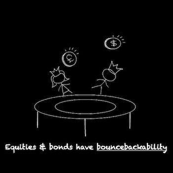
Do you have bouncebackability?

Most of us are likely to go through the investing meat grinder at some stage in our lifetimes. That’s the price of entry as an investor.

Just think of all the big crashes recently. How many investing experts managed to swerve the Global Financial Crisis? The Covid crash? Or the inflationary shock of 2022?

Predictive power is in short supply. Rather it’s staying power that we need.

We say keep your head together after a bad run and don’t chase the market. Give it time and it should turn in your favour. Sooner or later your patience will very likely be rewarded.

Take it steady,

The Accumulator

P.S. This concept was inspired / shamelessly cribbed from US asset manager and author Ben Carlson. See his post on US stock and bond rebounds. But I’d just like to say in my defence that I’m a big fan of Ben’s work. And I’d do it again, so help me!

  1. That is, inflation-adjusted.[]
  2. Real returns subtract inflation from your investment results. In other words, they’re a more accurate portrayal of your capital growth in relation to purchasing power than standard nominal returns.[]
  3. Òscar Jordà, Katharina Knoll, Dmitry Kuvshinov, Moritz Schularick, and Alan M. Taylor. 2019. “The Rate of Return on Everything, 1870–2015.” Quarterly Journal of Economics, 134(3), 1225-1298.[]
  4. Three-year annualised return, not shown in the table.[]
  5. Worst of All-Time![]
{ 22 comments }