You’ve heard of the latte factor, right? It’s the idea that trivial purchases add up over a lifetime to a massive wodge of could-have-been.
David Bach’s The Automatic Millionaire coined the term 15 years ago. Never one to miss the chance to make himself a million, he even published a book last year centered on The Latte Factor.
Bach is very readable if you enjoy that can-do American style, so it might be worth reading if you’re new to not flushing your money down the toilet.
Seriously: US financial guru Suze Orman made headlines last year when she said drinking a regular coffee was like “peeing $1 million down the drain”.
As Orman sees it:
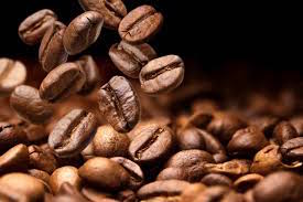
Let’s say you spend around $100 on coffee each month.
If you were to put that $100 into [tax-sheltered account] instead, after 40 years the money would have grown to around $1 million with a 12% rate of return.
Even with a 7% rate of return, you’d still have around $250,000.
Orman told CNBC:
“You need to think about it as: You are peeing $1 million down the drain as you are drinking that coffee. Do you really want to do that? No.”
Too graphic? It could be worse.
A few years ago the latte factor was recast for millennials as the avocado toast factor.
We really don’t want The Accumulator drawing one of his blackboard illustrations of that…
The latte factor: Semi-skimmed
I’m not against the latte factor as a concept. It’s a useful check against careless spending, and I’ve shared it with friends in the past.
The latte factor also puts a more respectable veneer on what my friends see as me simply being a tightwad!
However it’s always been easy to unpick the latte factor, even on its own terms.
Bach stated someone in her early 20s could save $2,000 a year by skipping a $5 daily coffee. This lucky and decaffeinated lady would then earn 10-11% a year to reach $1 million by retirement in her 60s.
Sounds good. But problems abound:
- Even 15 years on from The Automatic Millionaire, lattes still don’t cost $5. (Nor £5, in the UK. Try £3.) A latte from Starbucks in the US is $3. So that’s more like $1,095 a year saved.
- Bach’s 10-11% a year is a very punchy expected return. My co-blogger has long touted a 5% after-inflation expected return for equities. Maybe with inflation, a generous 8%. Does Bach think that foregoing a daily coffee will also turn you into a super-investor?
- Most people won’t want to have all their money in the highest risk-return asset (shares). They’ll want to sleep better at night. This is especially true as they get older. Holding bonds and/or cash to dampen portfolio volatility will bring your return down. Let’s call it a still-heady 5% with inflation, to stay consistent with Bach’s numbers.
- Compound $1,095 at 5% for 40 years and you get just $139,000. (Same in £s, of course).
$139,000 is a useful sum, sure, but you’re not even nominally a millionaire after giving up all those lattes.
Extra cream on top
I don’t want to bash Bach too badly. (Although it’s alliteratively appealing…)
The latte factor is meant to be a high-level concept and teaching tool, not a financial calculator. (Ahem – although Bach did create one of those, too. But his latte factor calculator enables you to tweak the variables to something more realistic).
The latte factor is one of those things that’s blindingly obvious when you get good with money – step forward all the regulars in the Monevator comments – but it can be mind-blowing if you’re not.
Try it out on a young friend or family member if you don’t believe me.
I’ve known people who will never spend £10 when they can spend £20. Showing them how small sums add up always produces a reaction – although sadly not so often a lifestyle revolution.
In fact, the world could probably be divided into those that understand the latte factor deep in their bones, and those that don’t.
I’ve been on dates where the other party over-orders wildly (and we were always going Dutch, so let’s have none of that) and I’ve died a little inside.
Years later I realized (or more likely was told) that they saw the careless abundance as a demonstration of how into making the date a great time they were.
Whereas what I saw was an unfinished bottle of wine and half a pudding – not just on the table, but also on the bill – which I then compounded over a long and never-to-be lifetime together.
My million pound coffee
With all that said, last Saturday I had a very visceral reaction to the latte factor.
Or maybe a moment of detente with the anti-latte factor.
I was meeting one of my best friends, for the first time since lockdown began. He was the first friend I’d seen away from my own home since mid-March.
We decided to get a takeaway coffee from the recently re-opened Gail’s Bakery near his flat.
I was early, so I queued for our coffees, six-feet from the nearest customer. The normally rammed shop contained just two staff and me. When our coffees were ready, they were brought outside and placed like two unstable hand grenades on a little table by a woman wearing a mask and blue gloves who immediately stepped back – smiling with her eyes, but very properly treating me like I was a leper.
The third place of a 1990s ad man’s dreams this was not. I’ve been to more welcoming GUM clinics.
But you know what? That coffee was magnificent. The whole shebang: Walking and sipping it from its environmentally dubious cup. Consuming the 10p of product and the £2.90 of taste, marketing, and nostalgia. Chatting – even at volume, at a distance – with my friend.
I knew I’d missed decent coffees on the go and obviously I’ve missed conversation. When lockdown began I noted how the streets seemed weird because nobody was walking with coffees.
Almost as if it was the 1980s. As if Friends had never happened!
Something bigger than a £2.95 coffee had vanished from my life.
Of course, I love coffee – and maybe you hate the stuff, or at least the mass-market escapism ritual that coffee has become.
But I bet you have your own ‘frivolous factor’, too.
Spontaneous sessions in the pub? Gym membership? Seeing films at the cinema alone on a weeknight? A serious National Trust and cream tea habit? City breaks via short-haul flights?
Did you only notice how much they mattered to you when they were gone?
Fool’s gold
It was always obvious you can take frugality and compound interest to extremes.
I once called it Buffett’s Folly, in honour of Warren Buffett’s house of the same name.
Even as he bought his property in 1957, Buffett calculated the $31,500 home cost him at least a million dollars.
That was on the back of what Buffy believed he would have generated with the money if he’d invested it in stocks instead, given his prodigious rates of return.
But Buffett still lives in exactly the same house, 63 years later. If the shingle still reads Buffett’s Folly, it’s with an ironic twist today.
By all means let’s save our pennies where we can (and avoid spending pennies, Orman-style, into the bargain. Boom boom!)
But we’ve just had a taste of what it’s like to be a monk in seclusion for the past eight weeks.
I rather enjoyed lockdown, truth be told.
But I wouldn’t trade it for meeting a friend for a decent coffee, on a whim, for the rest of my life.
Not for a million pounds. Not even for £139,000.
(Besides, coffee is really good for you!)