The main reason people try to keep up with the Joneses are the status games we all play.
Humans are social creatures. And throughout our evolutionary history, it made sense to be intensely concerned about our ranking within the tribe.
Status could mean the difference between eating, having children, and meeting – or meting out – violence.
Not to mention whether you get a backstage VIP pass for Glastonbury or you’re pitching your tent by the loos.
Status games are everywhere. Even when people have few expensive material possessions, you’ll notice they’ll find a way to get a status boost.
Think of holier-than-though students who flirt with communism. Impoverished kids trying to get an edge with a pair of rare Nikes. Or frugal savers who position themselves as above “all that consumerist crap” and in doing so aim to turn their practical choices into moral virtue.
As you do
Another – better – reason to twitch the curtains to see what our peers are up to is imitative learning.
We learn to fit in and get on by copying each other. It’s a social reality.
Before you say you’re “above all that crap” too, spend an hour in a kindergarten. See how impressed you are with the kid who ignores all the norms of how to eat, when to shout, and whether to use the floor as a potty.
Of course I still like to believe I’m different. Maybe you do too.
But the base rate before we even think about diverging is to know what others are doing with their lives.
Which is usually school, job, taxes, marriage, mortgage, kids, taxes, pension, retirement, taxes, death (and maybe taxes).
All fluffed up
Some of these aspects of living are easier to pick up by copying – perhaps subconsciously – than others.
Fitness habits, say, or how to handle your child’s temper tantrum. Or when to suck up to a boss, which may be much the same thing.
But other stuff happens behind closed doors. We can only wonder how everyone else is doing it.
Perhaps that’s a secondary reason for the popularity of porn?
We’re all curious as to how everyone else is getting it on. For purely intellectual reasons, you understand.
Of course, for most people pornography is unrealistic. (The Accumulator excluded. He’s a legend in the bedroom and I claim my £50 in PR fees.)
We still can’t help benchmarking ourselves to all that athletic activity.
And similarly, we keep one eye on the Joneses – despite knowing better.
We usually don’t know what the Joneses earn or how they invest their money. As with their habits between the sheets, we only get the vaguest sense of whether we’re doing it right from the output presented by others. We mostly don’t know the inputs that enable it all.
And again, before you say you’re above such petty comparisons please spend 30 minutes sitting on the pavement outside Tesco asking if anybody can spare any change.
Then come back and tell me you’re oblivious to your status.
Size matters
We all agree judging the Joneses ‘success’ by the car they drive or the handbag they tout can be as misleading as listening to a 17-year old boasting about their body count.
Nobody is doing an audit here. The Joneses may be whacking it all on a credit card. Perhaps none of that spending is making them happy, anyway. The whole shebang could be a mask.
Alternatively, they might be having a ball. Zero debt and up to their eyeballs in well-provisioned pensions, an ample larder, tasteful consumer goods, and a steady supply of plane tickets to sunnier climes.
Who knows? To go deeper we’d need a more complete picture.
This might be one reason for the appeal of our FIRE-side chats on Monevator.
The subjects are Joneses of a sort, sure. But the interviews highlight factors we understand to be more consequential traits to study.
How they invest, say, rather than how they do up their homes.
Or how they save, versus where they shop.
These traits are usually invisible to us in everyday life. Yet they’re much more indicative when it comes to achieving long-term financial success than material proxies of status.
Behind the numbers
Broad brush surveys can also give us insights into what goes unseen with our fellow strivers.
Even the wooliest statistics can be surprising.
I was somewhat taken aback in 2023 to discover via a simple poll on Monevator that over 60% of our readers are higher or additional-rate taxpayers, for example.
From years of interacting with readers, I know your net worths typically skew higher than average, too.
This data has implications for the type of articles our readership is likely to want.
But it should also inform how we all approach reader comments left on our site.
Being relatively wealthy – or on their way to it – most Monevator readers’ lives won’t change much if they lose £5,000 in a downmarket, for instance, or if they make an extra £2,000 a year.
That is very different to the norm on many other sites – especially discussion forums such as Reddit, which skew a lot more young and up-and-coming.
Indeed, in an ideal world you’d see a reader’s age, income, net worth, dependents, and even their monthly outgoings alongside every comment they make – whether here or on Reddit.
That’s obviously impossible. Instead we can only get a sense of who someone is if they repeatedly write under the same username over a very long period of time.
The vast majority do not, which is why I urge constructive skepticism when it comes to financial opinions on the Internet.
You nearly always don’t know who you’re talking to. Yet personal context can change everything, turning prudence into folly or an investment into a gamble.
One (very rich) person’s £20,000 meme stock punt gone whoopsie, for instance, is another (much less rich) person’s would-be house deposit turned to smoke.
How people invest their pensions on one online platform
Enter Interactive Investor’s new SIPP index (note: affiliate link), which has been cited by a few mainstream financial writers recently.
I thought perhaps this would give us some interesting insights into how people are choosing to invest pensions, a decade into the post-freedom era.
The report – which II is touting as a quarterly ‘index’ – certainly alludes to such insights. Both on how people invest pensions in the accumulation phase, and also when they begin to drawdown an income.
So as a financially-curious human – let alone an investing blogger – it promised to be interesting reading.
In truth though I gleaned surprisingly little useful info from this first incarnation of the report.
That’s because the platform tells us what kinds of financial vehicles its customers choose to invest pensions into – but not what those funds, trusts, or other stuff actually hold, except in the case of cash.
So we discover:

Source: Interactive Investor
…but what does this really tell us? (It probably also doesn’t help that I struggle to tell the difference between some of these shades of blue!)
True, we can see there are more funds and direct equities in the accumulation phase, and a lot more in investment trusts in the drawdown phase.
But without knowing what assets these funds are actually invested in, this information is pretty useless.
What’s more, is a greater share of investment trusts held in drawdown accounts because people are choosing to lean on these products as a source of retirement income?
It could be. Or it could be that Interactive Investor clients who are already in drawdown are from an older generation, and so are simply more inclined to favour investment trusts in the first place.
A table showing the most popular funds held in SIPP accounts before and after drawdown doesn’t shed much light either:

Source: Interactive Investor
Good luck getting much insight from this data dump – except perhaps that it’d be nice to own shares in Vanguard.
It’s what we invest pensions into that matters
What would be more useful would be to see what assets such everyday investors are holding on a ‘look-through’ basis.
For example, if they own a LifeStrategy 60/40 fund, then 60% would be allocated to their equities bucket and 40% to their bond bucket.
Total everything up across all their funds, trusts, and other investments, and we’d see a more useful overall asset allocation picture. It’d also show how it shifts through time too as they move into drawdown.
Instead the II SIPP report presents an old-fashioned marketers’ perspective on investing.
The report tells us what products are popular, which is doubtless interesting if you work at Vanguard or FundSmith. But it doesn’t tell us much about investors’ attitude towards particular assets – or even risk.
It is like when friends ask me about investing and tell me they “have an ISA”.
First you have to ask whether it’s a cash ISA or a stocks and shares one. If the latter, you must ask them what’s in it. Finally you gently explain that the ISA is only a wrapper – it’s not the actual investment.
It’s similar with a fund or an investment trust. What matters most for investing insight purposes is what these vehicles hold, not how they’re set-up and marketed.
Trend spotting
To be fair, the report does offer a few interesting tidbits in the commentary, albeit based on data that’s not surfaced to us as readers as far as I can tell.
We learn:
- Passive funds have grown more popular in the last two years. They now comprise a majority of the top ten most popular funds for both accumulators and those in drawdown.
- Younger customers are more into ETFs than older folk who prefer traditional funds and trusts.
- Female clients saw higher returns than male customers over the past two years across all ages. This appears to be because they hold more collective funds and trusts, and fewer individual shares.
- Younger clients in accumulation mode have seen much higher returns over the past two years than older investors in drawdown. That’s as you’d expect, because the latter should be taking less risk.
There’s the outline of a useful report here and I hope Interactive Investor continues to develop it. They get a lot more of this stuff to chew through in the US than we do, and it’d be churlish not to welcome additional UK-centric data.
But I’d like the platform to think more holistically about asset allocation for future iterations.
Rich pickings: how the wealthy do it
All this made me curious for more. So I hunted around and found a couple of fairly recent reports that do give us more specific asset indications – albeit not for what’s held in SIPPs alone.
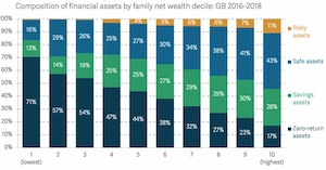
First up there’s the Resolution Foundation’s report on the wealth of richer families.
This report was published in 2020, so take it with a pinch of salt – we’re on the other side of a bond market rout, after all, and some of its data goes back to 2018 – but for what it’s worth the Resolution Foundation reckons wealthy families were financially positioned as follows:

Source: Resolution Foundation
This is somewhat interesting, if dated – ‘zero return’ assets being to 2020 what flares were to 1975 – but at least it shows us how a reliance on cash decreases with greater wealth, and also that risk-taking increases.
However as I read the report this chart only gives us a sniff of where people actually have their money. That’s because it only seems to apply to the ‘financial asset’ sliver of how the Resolution Foundation divvies up overall household wealth.
And crucially ‘financial assets’ would seem to exclude pensions:

Source: Resolution Foundation.
So we’re back to context again, right? If I have a chunky paid-up pension that constitutes a huge chunk of my assets, then I’m probably going to take more risks in my online share dealing account.
Anyway you can read the full report for further breakdowns, which partly unpick this while introducing other issues.
Incidentally, the Resolution Foundation’s subsequent two wealth reports don’t break down financial asset allocation at all.
Lies, damned lies, and pension statistics
The Resolution Foundation cites data drawn from the Office of National Statistics (ONS).
And poking around in the ONS archives does indeed flag up a treasure trove – albeit in rather raw form.
In particular, a 2023 data dump tells us how funded occupational pension schemes are invested, including asset allocation.
Loading the data into a spreadsheet yields the following ‘look-through’ breakdown of how pooled investments are allocated as of Autumn 2023:
| Asset class | Percentage |
| Equity | 35% |
| Fixed Interest | 10% |
| Property | 2% |
| Mixed asset | 35% |
| Hedge | 1% |
| Private equity | 0% |
| Money market | 4% |
| Other* | 13% |
Source: ONS. * We’re told ‘Other’ pooled investment vehicle asset types include cash, commodity/energy, structured products, unknown and with profits.
Job done? Not quite. The above data only breaks down pooled investments, but total pension assets also include direct investments into everything from cash to corporate bonds to unquoted private equity.
However these amount to only about another 11% or so of pension assets.
A bigger snag is the huge allocation to ‘mixed assets’ and ‘other’. This brings us back to the Vanguard LifeStrategy problem.
We could be looking here at 80% equities and 20% bonds – or 5% kumquats and 95% vintage cars! We just don’t know.
Still, the big picture seems to be much more than 50% in equities – I’d guess closer to 70% – along with a decent chunk in bonds and a smidgeon in cash.
Which seems about right?
Funds finding favour
Finally, another way to envisage how our financial assets are invested – again not only our pensions – is to see where UK investment funds have allocated their money.
For this I turned to The Investment Association’s latest survey – and I’m pleased to feature another colourful chart to conclude our romp:

Source: The Investment Association
Again, this information only takes us so far in understanding exactly what assets the Joneses have bought into.
For starters, while the Investment Association says…
‘our funds data includes assets in open ended funds, investment trusts, ETFs, hedge funds and money market funds’
… this notably – and not surprisingly – excludes cash and directly held property.
Also, many entities besides private individuals have money invested in funds. But it’s all captured here.
And even where the money is ultimately on the balance sheet of a private investor, it will include Richard Branson and the Duke of Westminster as well as you and me. Such riches will further distort things.
Also ‘mixed asset’ is in there again to ambiguously stink up our conclusions.
Perhaps the clearest takeaway from the graph concerns a different if now very familiar story – the shrinking amount of UK fund industry money allocated to UK equities over time.
We (mostly) don’t invest pensions in pie-in-the-sky
Googling around provides plenty of other snapshots that I could have included in my review above. I haven’t exhausted the Internet!
But I’m calling time on account of my sore fingers and your waning interest.
Perhaps there is a perfect review of how pensions are invested out there somewhere. Please do share any better sources you’ve found in the comments below.
So have we learned anything from this exercise?
Only really that most money is broadly allocated across a wide range of assets – and that allocations do change with age and (possibly) with the shift to retirement.
That isn’t a newsflash. But perhaps it’s reassuring that while AI behemoths, cryptocurrencies, and meme stocks clog the agenda, the moneyed Joneses continue to plod sensibly along with broad portfolios that will outlive any particular fad.
And our pensions should be invested that way too.


Interesting, TI, and thanks for putting in the work to uncover how UK pensions et al are invested.
What I found curious is how the Resolution Foundation define unit and investment trusts to be safe assets but shares and bonds to be risky. I can only assume they mean that the aggregation of shares/bonds in any particular unit/investment trust as lowering the risk compared to holding all of your pension in, say, GSK (GlaxoSmithKline)?
Incidentally, given the difficulties you found in sourcing data, it makes me wonder how HMT can assess how their decisions would affect pensions (e.g. how much people would put into the under different taxation scenarios) and the downstream consequences for the underlying assets. I had thought you’d unearth some other more substantive from the ONS as a consequence of this.
In terms of how pensions are invested during accumulation I heard from my pension trustee that more than 90% of clients never log on to their DC accounts so are in the pension ‘default’ allocation. If you could get data on the default profiles then that would be the picture.
You do tend to get ‘number blind’ when you start delving in to pensions and forget that £800 might equate to half a year’s savings for a taxed employee.
A few years ago I wondered how everyone and his wife had a newer and better car than me and then someone explained about personal contracts so that they are not riding around on an asset, they are sitting inside a liability.
Oh, the ‘x-ray’ facility on II is very limited too. It doesn’t know what to do with PE, commodities, gold, mixed asset stuff so don’t hold your breath.
@Mr Optimistic — Wow, 90% never log-in!? That’s incredible. Good tip though I guess it really just tells us what Nest or whoever thinks is the default pension stance, not what actual investors making decisions think. I was more looking for the latter. I also remember Nest went a bit woke a few years ago, which personally I’m completely fine with in terms of the anti-climate change stance but *not* in terms of the *default* pension for people who never log-in being anything other than the best legal risk-return-maximising option for pension holders. (Giving them the option to swap out to something more ESG-friendly is fine of course — even to be encouraged.)
@Curlew — There’s definitely a deeper dig to be done in the ONS data — and a broader hunt could be made across all sources. I had earmarked today’s post to be insights from the Interactive Investor report but when I actually got around to looking at it I found it wanting as discussed, hence the hunt around elsewhere. It wasn’t a several day’s deep dive, say, more a broad overview and links to reading for the curious. Perhaps for the future if it’s of interest!
Interesting. I’ll probably ponder in due course after my initial reaction that surely Ice T’s popular beat combo was named after a different kind of body count.
I’m not sure the charts are that helpful because e.g. there are plenty of funds and ETPs(ETFs) that mirror each other and the choice between them may be more an outcome of the wrapper in which they are held than any intrinsic judgement on riskiness. Similarly why tell us ISAs are safe assets and directly held shares or bonds are risky (I know this isn’t your categorisation).
On the never logging in point, if you aren’t confident or experienced or have invested time in understanding things there is possibly something to it for the majority. It prevents rash decisions and panicked selling for starters. We who engage here forget quite easily that the state of financial education in the UK as a whole remains low and it is a somewhat geeky topic. For instance though I am surrounded at work by highly numerate professionals I would find it hard to identify someone I could expect to have a “common baseline” discussion about pension drawdown strategies and tax efficiency post retirement.
“That is very different to the norm on many other sites – especially discussion forums such as Reddit”
I always get the impression that posters to r/UKPersonalFinance are on at least ~£80K.
It must be that padded rubber gimp suit @TA wears in winter!
@TI – I had to work quite hard to get a non-ESG whole market index tracker in my pension. I’m not quite sure who to blame, Standard Life or my company’s pension trustees (I think the latter), but someone’s clearly been sold hard on a certain subset of offerings which I consider to be a poor selection.
On ESG in general, I agree with the principles, but the implementation of ESG seems, to me at least, to serve to improve none of environmental, social or governance goals, but rather to greenwash the companies that are represented in them.
On 90% of DC account holders never logging in, remember MV (June 2015) reporting on Nate Tobik at Oddball Stocks: “Fidelity released a study discussing a performance breakdown for their accounts. The clients that did the best were the ones who were dead. The second best performing set of clients forgot they had Fidelity accounts. It seems like a formula to beat the market is to start an account, forget about it, then die”
I do wonder if the RF or ONS knows exactly about my own finances…
From a recent road trip holiday around England, it seems to me that life in the suburbs is the surest way to keep up with the Joneses.
Who knows what your savings/investments are when all you can see is someone’s car?
My own long view is that the spenders will run out of money at some point and it won’t matter because I’ll be retired, loaded and living it up somewhere else.
I can live with low status – but it’s come from a necessity (I’m not a cool person for example and didn’t have rich or generous folks growing up) that I’ve made into a virtue.
And I can’t believe so much is held as zero interest assets – I’m always cash light (no emergency fund for me and I’ve always got £10-£25k in stooze debts).
But everyone’s situation is different.
While it only deals with pensions in payment, the data at https://www.fca.org.uk/data/retirement-income-market-data-2022-23 are wide ranging (e.g., size of pensions pots, advice sought, pension products used, etc.) and interesting. Unfortunately, what pension pots are invested in is not included. I also note that there were a few internal inconsistencies in the spreadsheet (some cells point to the wrong bits of data – I gave up trying to contact them).
A couple of further comments:
I’d agree that the ii plot is poorly presented – the other stack plots are much better since the legends are in the same order as the stack (which means that you don’t have to guess at the colour – which I too found tricky).
‘surfacing’ of data (first para under ‘trend spotting’) is a linguistic bugbear of mine having had to sit through innumerable meetings (harking back to last week’s conversations) where data were surfacing more frequently than a U boat with a dodgy diesel.
The results of the II data was fascinating to me, as I have had my SIPP with them for years, and it showed how wide a spread there is out there.
I am 5yrs from drawdown and for the past 2yrs I’ve been 30% money markets (getting 5% with close to zero risk) and 70% S&P 500 rebalancing each quarter and I will likely follow this strategy into drawdown,
Each to their own, of course.
My work just moved pension provider to Aon Mastertrust. They don’t offer a global passive equity fund.
Instead I had to create a proxy from their other funds on offer by weighting my investment between them.