Like an Empty Nester cocooned in equity in a four-bed detached house overlooking the Green Belt who frets about what his daughter will do to afford a £200,000 bedsit in Brixton, I’ve got a split mind when it comes to UK residential property.
- UK houses still feel expensive, not least by the traditional measure of the house price to earnings ratio.
- On the other hand, I agree there’s a shortage of houses in the UK – or at least of property for sale of the type people want to buy (within reason), where they want to buy it, at prices they can pay.
I was therefore able to post in late November 2011 that given the various attempts [1] to prop up [2] the ailing property market (especially the latest NewBuy [3] mortgage indemnity scheme) shares in house builders [4] looked a better bet than the houses themselves.
As a group, the UK’s seven largest listed house builders are up more than 30% since I posted. Not bad for middle-class dinner party chat turned into an investment thesis!
But I’m not gloating. While shares in house builders have done well in double-fast time, my investment has barely dented the opportunity cost of missing out on six-figure gains from London property over the past decade.
More importantly, there’s a flaw in my two-handed view of the market as glaring as a three-story extension without planning permission in the Antarctic.
The contradiction: Prices are set by supply and demand, so if there’s a shortage of houses and strong demand, then houses can’t be too expensive. Can they?
A quick recap on higher house prices
Most people – even most homeowners – seem to think UK house prices are pretty high [5], even after the falls of recent years.
But a commonplace view isn’t necessarily correct – and a knee-jerk ‘sticker shock’ reaction to a very large number is a dangerous way to judge value. Before you know it, you’re an 80-year old grannie who complains about the menu at Pizza Express, on the grounds that a meal with a decent bottle of wine used to cost 50p, plus a quick snog at the end of the night.
To illustrate my point, check out this graph of house prices since the 1960s, courtesy of Nationwide (via Finance Blog [6]):
 [7]
[7]The 1960s: Flares were big but house prices were not
More clued-up grannies are well aware that inflation [8] means 50p isn’t what it used to be (although I’m sure a snog remains welcome). The prices of many things rise a great deal over time – sometimes far faster than inflation.
We saw when we looked at historical house prices [9] that price growth isn’t quite so shocking when viewed in inflation-adjusted money (i.e. in ‘real’ terms).
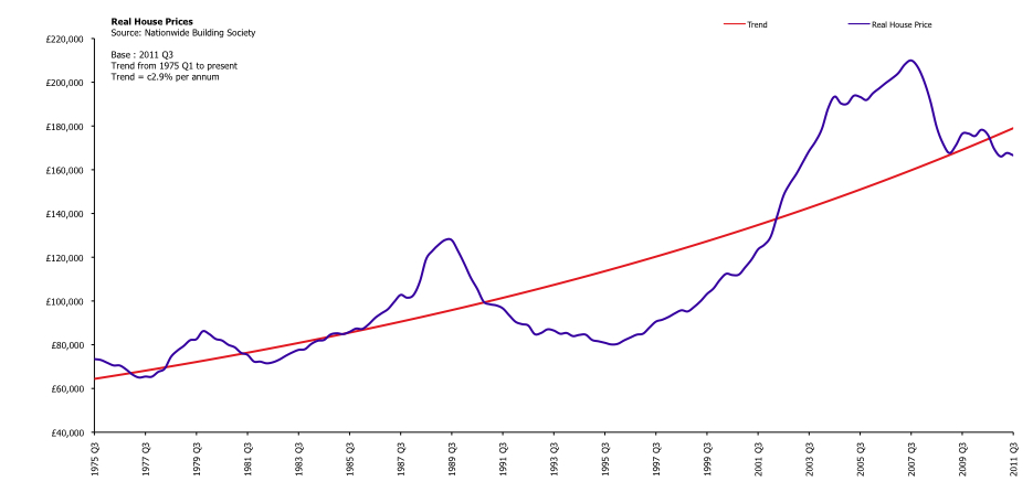
Indeed, real house price growth has recently fallen a little behind trend:
 [10]
[10](Click to enlarge this graph of UK house prices in real terms)
Real house prices [11] have been growing at about 2.9% per year since the mid-1970s. In other words, houses have been getting more expensive relative to the average basket of goods for most of the past four decades.
Now, the official RPI basket includes a nearly 24% weighting towards housing [12] costs, so there’s some element of circularity to this.
It’s probably more useful therefore to look at the cost of houses relative to earnings, since that’s where most of us find the money to pay for one.
House price to earnings ratio
Comparing house prices to earnings was what scared me out of buying in London around 2003/2004. And on the historical measure of the house price to earnings ratio, UK property still looks superficially expensive.
Here’s a recent-ish graph of house prices to earnings from The Telegraph [13]:
 [14]
[14]Don't look down!
The house price to earnings ratio approached 6.5 before the property slump – a level unthinkable just a few years before. You can see that even though it then declined sharply towards its long run average, by 2011 the ratio was still above the level at which the last property boom peaked in 1989.
The price to earnings measure in the graph is also higher than when I first got cold feet about buying a house, partly due to graphs like this one. That decision cost me at least six figures as prices continued to rise regardless, so be warned about putting too much store in this ratio.
Since 2008 the house price to earnings ratio has been coming down, partly as wages have increased a little despite the recession, but mainly because prices have been falling.
But can we really say the ratio ‘should’ fall below some average level, as per the graph above, before we can call houses fair value?
I don’t think so, for the simple reason that this ratio has been rising for years. I plotted my own graph setting the latest house price data from Halifax against the UK National mean full-time wage for men (same source) and added a trend line as follows:
 [15]
[15]House price to earnings ratio for UK houses (Click to enlarge)
The black line shows that over the past 20 years, the house price to earnings ratio has been creeping higher. In fact, houses now look slightly good value on this single measure.
Of course, you can quibble.
Firstly, the bigger the boom – or bubble, if you prefer – the more the trend line is potentially distorted.
Also, it clearly matters where you start and end your graph. I’ve used the two decades of data Halifax makes available, but the trend line would look very different over say 1990 to 1995, or from 2007 to 2011.
I seem to remember that when I started closely watching this statistic around the turn of the century, 3.5 was said to be the ‘natural’ level of house prices versus earnings. Looking at the graph above, it now seems this view came about largely a result of the depressed prices of the mid-1990s.
Another criticism might be to ask why the ratio should be based on male full-time earnings, when so many women have entered the workforce over this period.
I think that’s true – but it’s also another reason why the ratio may have moved permanently higher. More women bidding for houses against (or in partnership with) men will clearly increase the ratio for single male salaries, too.
All this – and other weaknesses, such as the fact that the ratio is based on gross income, not mortgage affordability, for example – means I now think the ratio should be taken as just one of several factors in judging whether house prices look too high.
If somebody had tried to bet on the long-term trajectory of food prices based on the average household’s grocery bill in the 1950s versus wages, they’d have ended up bankrupt.
If food spending can decline over five decades as a percentage of our spending, then might we not spend more on housing? Or cars? Or smartphones?
I’m not saying spending more money on houses is desirable either individually or for society. I’m just pointing out that we have been on a long march from subsidence living to buying the latest iPad.
Perhaps housing has become a luxury item for many, in that they’re prepared to spend more of their discretionary income to get the best they can?
But… salaries do influence mortgage sizes
There’s one important caveat to all this.
Before the lending was relaxed over the past couple of decades, mortgages used to be rationed out by banks on a much stricter basis of salary.
One repeatedly hears that 3x your salary was the limit, though I can’t remember ever seeing concrete figures.
If banks do go back to old-fashioned lending as a result of the credit crisis, as some suggest [16], then perhaps this lending ratio will come down again to reflect tighter access to mortgages, rather than the demand for housing.
Indeed, in London the price to earnings ratio remains more elevated – by my calculations it’s turned higher again, in fact – partly because so many properties are bought with a far higher proportion of cash, or no mortgage at all.
That in turn means the technical constraint implied by bank lending is less relevant in London. Mortgages don’t matter so much.1 [17]
Household income and inflation
I’ll probably get hate mail from property bears for suggesting the price to earnings ratio isn’t written in stone.
Before my email server blows up, I should stress that while I now believe the ratio of house prices to average earnings is a bit of a moveable feast, I agree there’s a commonsense relationship between how much people earn, and how much they can then spend on their largest single asset in most cases, their home.
Whatever multiple banks happen to apply, salaries remain the key criteria they use to decide how big a mortgage to grant, which in turn (partly) determines how much money is chasing property at any given time.
Mortgages aren’t everything, especially in the current depressed market – a record 40% of homes were bought with cash [18] in early 2011, more than double the rate of five years before, for example.
But in most of the UK, cash-rich buyers are in the definite minority and mortgage finance drives the market.
Even in a world without mortgages where we saved up to buy a home [19], salaries would still ultimately dictate house prices (alongside inheritances and winnings from spreadbetting [20], presumably).
And the fact is salaries have not gone up at the same pace as house prices.
This lagging is captured in the elevated house price to earnings ratio. But a closer look at inflation-adjusted earnings is also revealing.
Using data from Measuring Worth [21], I created the following graph of nominal and real wage growth in the UK between 1982 and 2010, which neatly covers the same period as the house price to earnings graph above:
 [22]
[22]A graph of real earnings in the UK (Click to enlarge).
Over the period from 1982 to 2010:
- The increase in nominal earnings in the UK from around £5,600 per year to £23,500 is an impressive 320%.
- But in inflation-adjusted terms, the rise in earnings is much more modest – just 52%.
Eye-balling the graph of real house prices above suggests real prices rose by around 200% from 1982 to their peak in 2008. Far faster than earnings!
This couldn’t continue forever – and it didn’t.
Earnings aren’t everything
So what have we discovered? Nothing definitive, which is why house prices remain an enduring subject of conversation at a certain kind of dinner party, just ahead of “no, those aren’t my car keys…”
It’s clear growth in real earnings has massively lagged real house prices, and that’s partly captured in an increasing house price to earnings ratio.
If you accept the rising trend over three decades to spend more of our incomes on property, then the ratio no longer looks so stretched, especially outside of London. This might indicate house prices are closer to fair value.
However by itself, the house price to earnings ratio doesn’t seem to be a solid indicator as to whether house prices are cheap or not, or whether they will rise or fall.
In particular, the simple ratio overlooks a vital component of mortgage affordability – the very likely reason why prices didn’t fall as much as they might have in the downturn.
That key missing variable is of course interest rates, which determine how much of your earnings will actually be gobbled up paying off your mortgage.
As anyone who has read this far will know, interest rates have plunged over the past 30 years, which you’d think must be a big factor in driving house prices.
I’ll therefore look at house prices and interest rates in my next post in this series.
(Subscribe [23] to make sure you get it!)
- The London property market is really a beast in itself. I may do a separate post on the other factors that drive it, which range from foreign buyers and bank bonuses to true scarcity and, recently, the Olympics [↩ [27]]